Expedia GroupCOMMUNICATIONS STRATEGY & DESIGN
DESCRIPTION
Enhance Expedia Group's communications to elevate the travelers' experience across all stages of their user journey, boosting trust and improving app retention.
When
Sep 2021 - Jan2024
UX Designer
  • Design opportunities to add revenue-generating modules to highly-opened transactional emails
  • Identify gaps in the mobile push user journey, boosting traveler trust, user retention, and revenue per booking
  • Create in-app communications governance to standardize UI patterns, placements, and behaviors

Impact

$15.6 M
Annual gross profit (GP)
2.78%
Increase to app downloads

Project Goal

Increase revenue

Improve brand loyalty

Boost app retention

KPI: Revenue earned from cross-sell opportunities
KPI: Repeat booking and grow member sign-in
KPI: App 6 week retention through email clickthrough

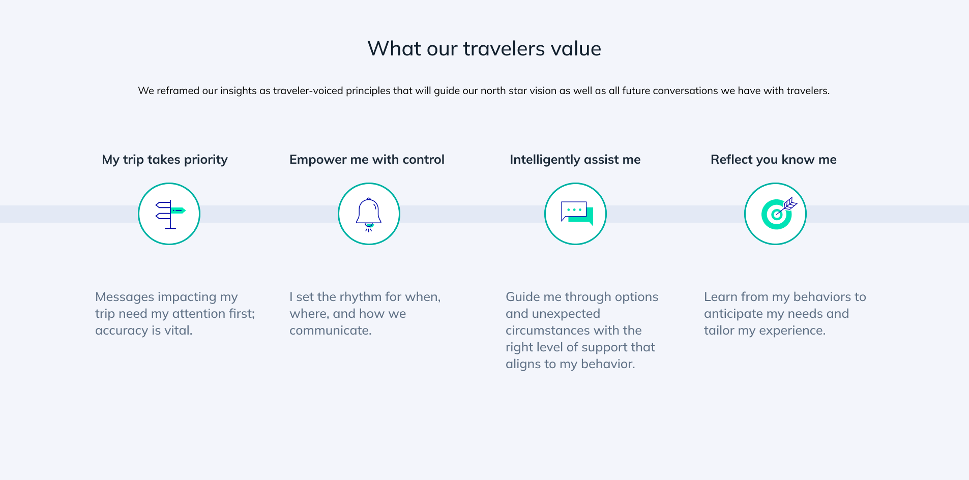
Providing personalized and relevant recommendations enables Expedia Group to provide more value to travelers.

Presenting the right message(s), at the right place, right time helps guide more seamless trips and bolsters brand loyalty.

Users who enable app notifications upon installation open the app 2.78% more

Discover - Comms Ecosystem

Before evolving EG's communication experience, our team audited the current comms environment to identify:
  1. What channels, internal and external, do these communications surface?
  2. What are the technology and platforms power these communications?
  3. What communications are sent today?
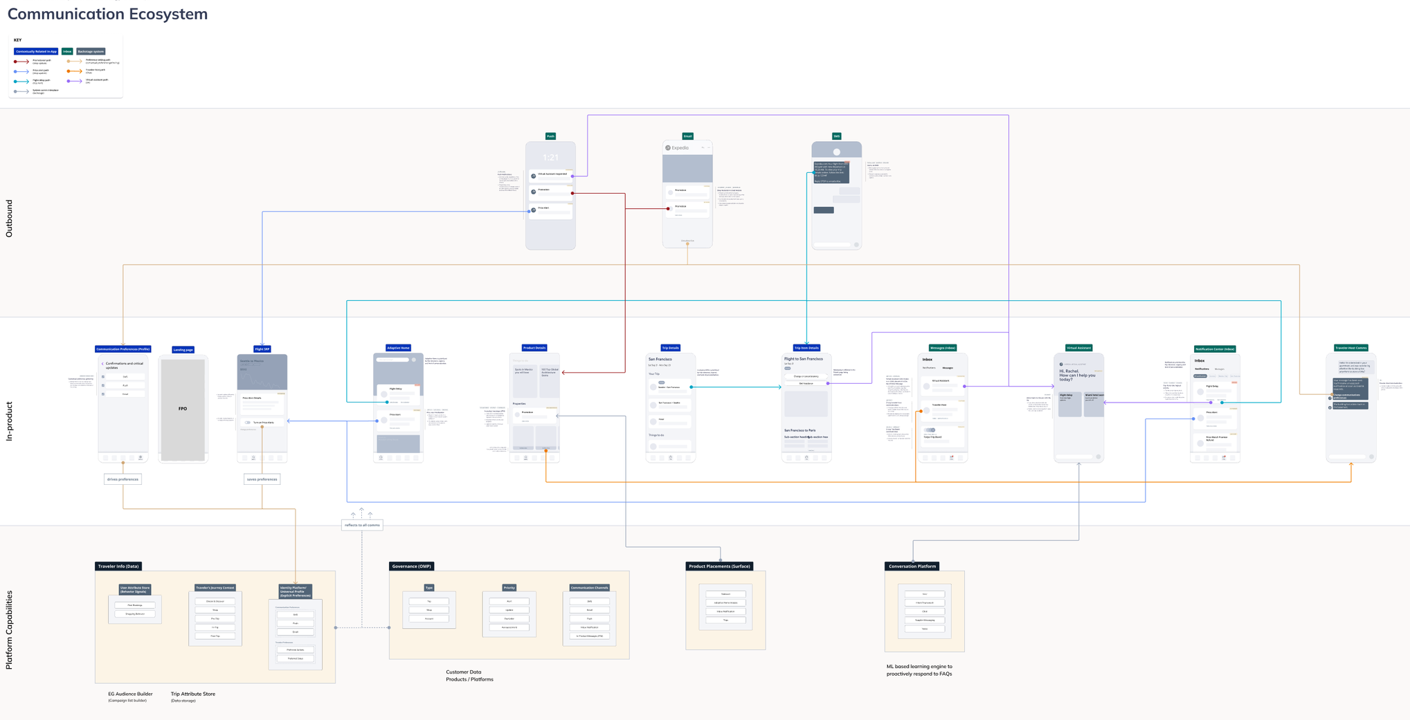
Current-State Communications Ecosystem Map
Historically, communication owners at Expedia Group created content and visual patterns to suit their ad-hoc, specific needs. Over time, this made the Expedia Group (EG) communications experience disjointed and challenging to scale.
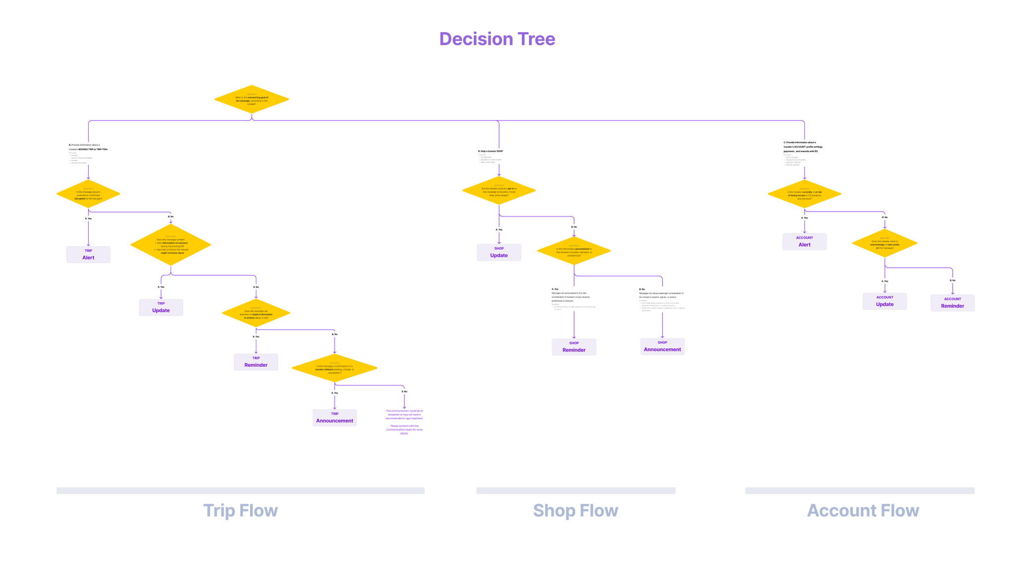
Define - Comms Ecosystem

Collaborating with Product and Content design partners, we defined the north star of what an ideal communications experience entails.
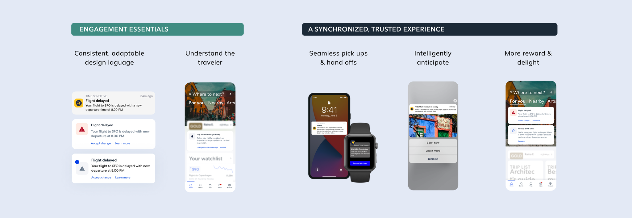
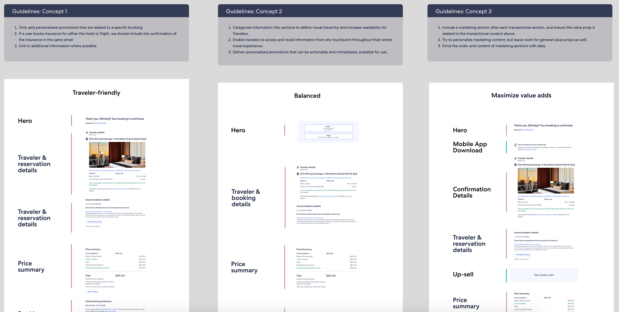
Based on visual priority, specific patterns and placement behaviors were recommended as the standard. For instance:
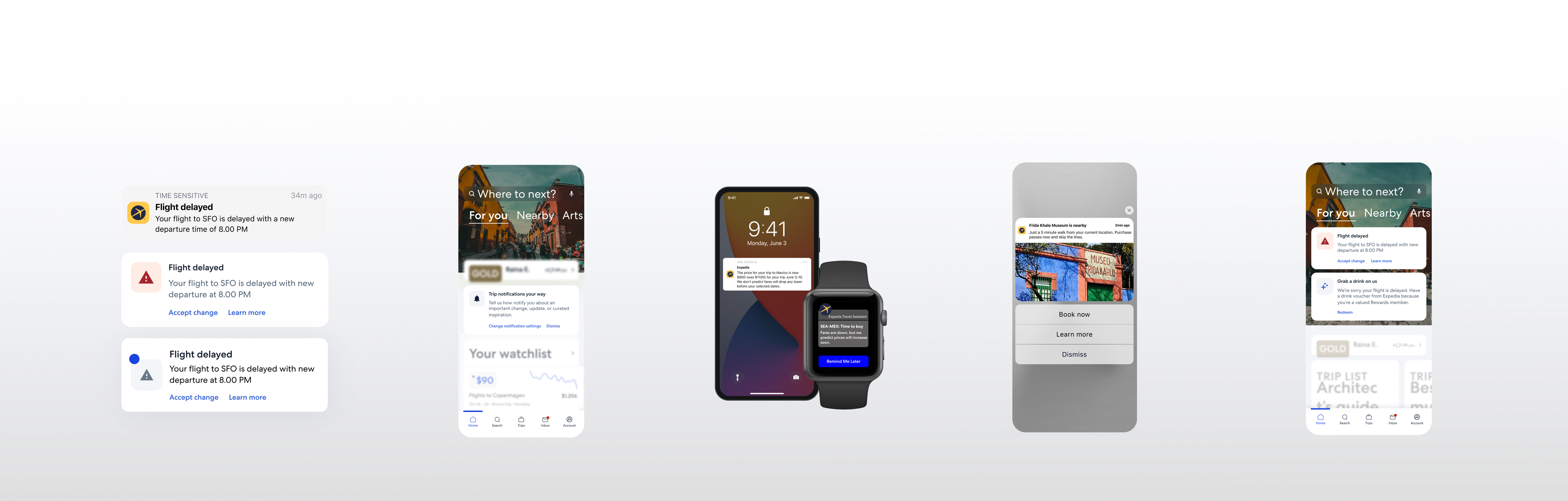
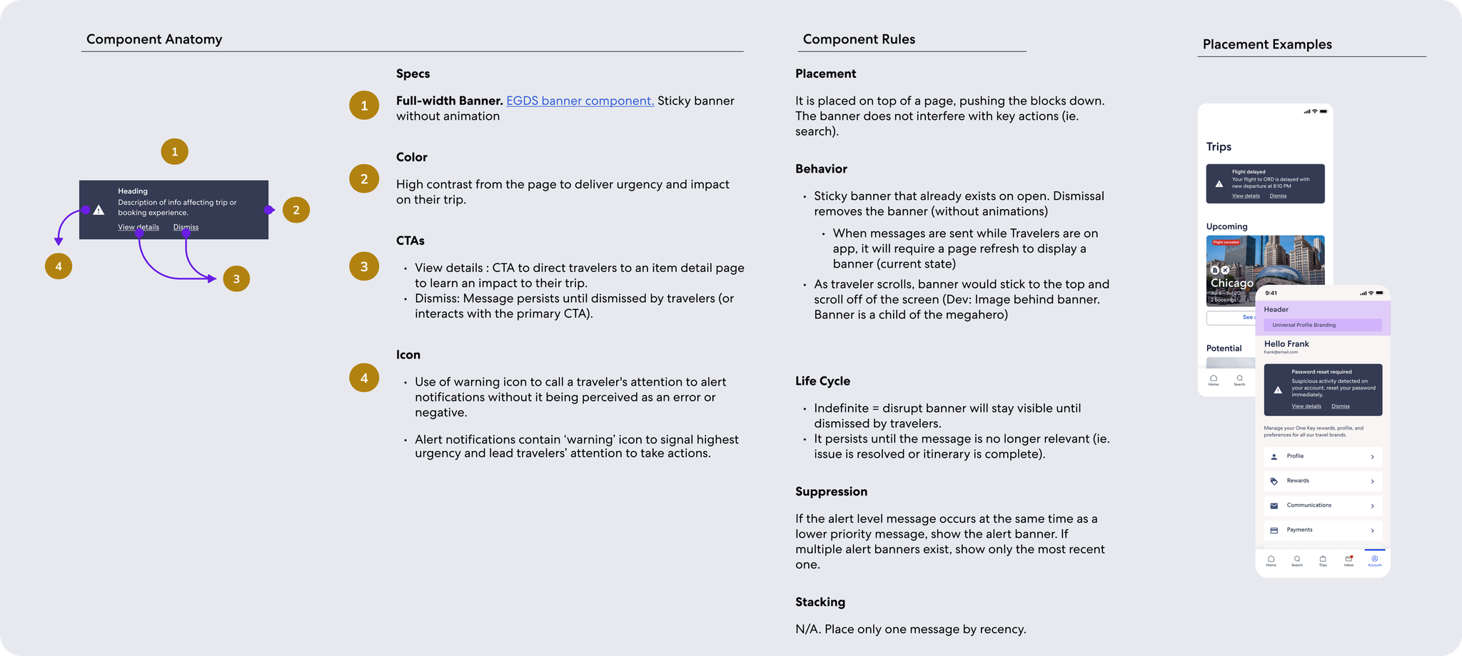
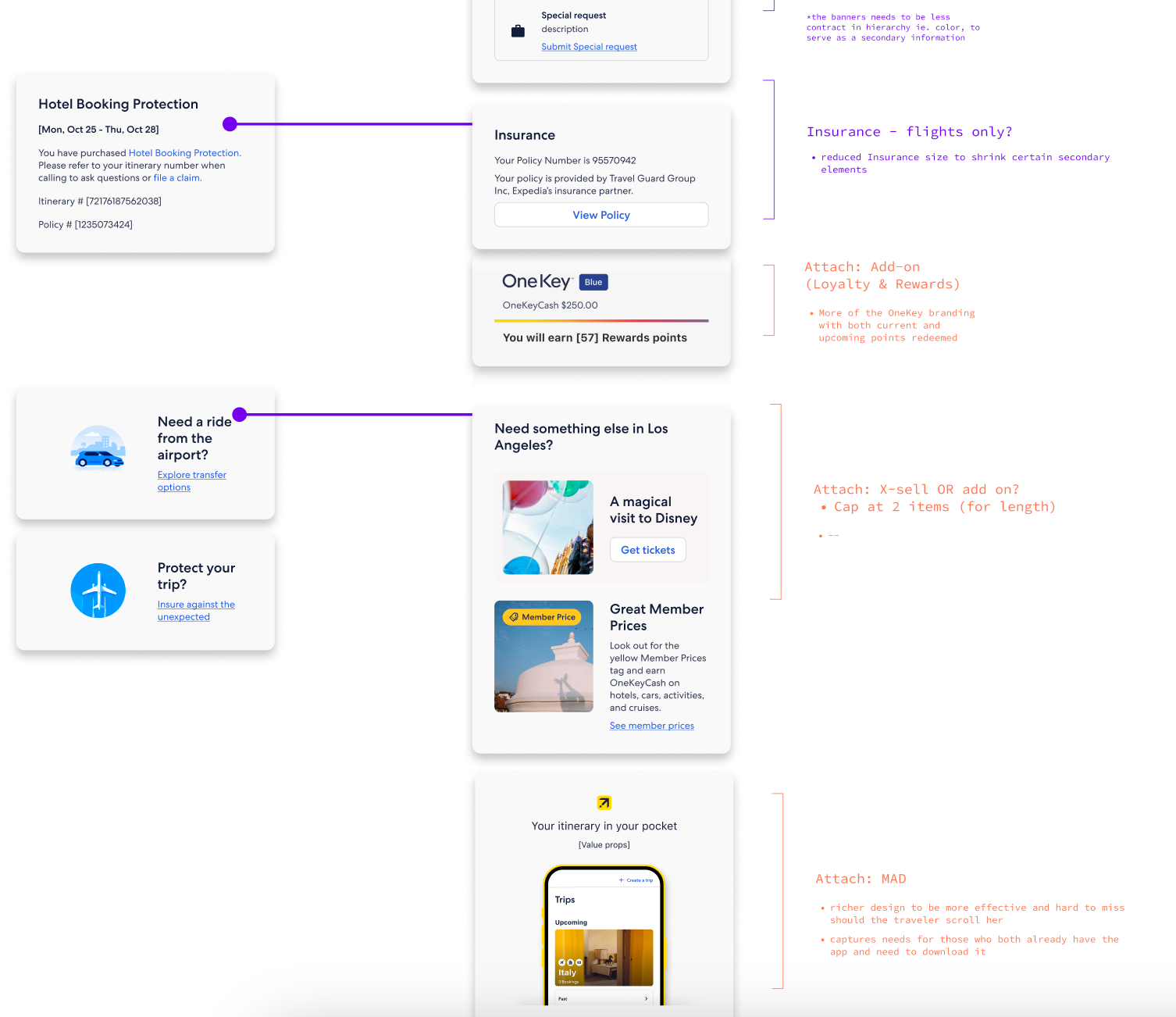
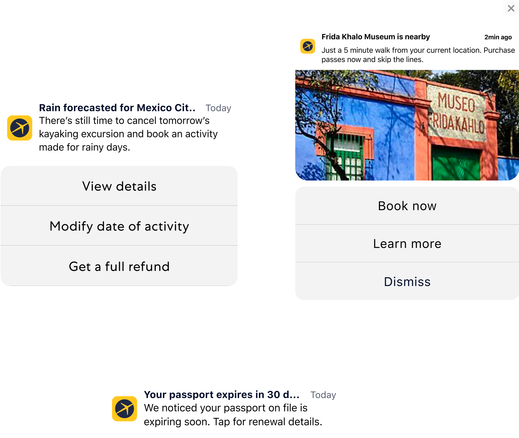
  1. Dark Banners: high contrast component that requires explicit dismissal or action, for highest priority messages like weather alert
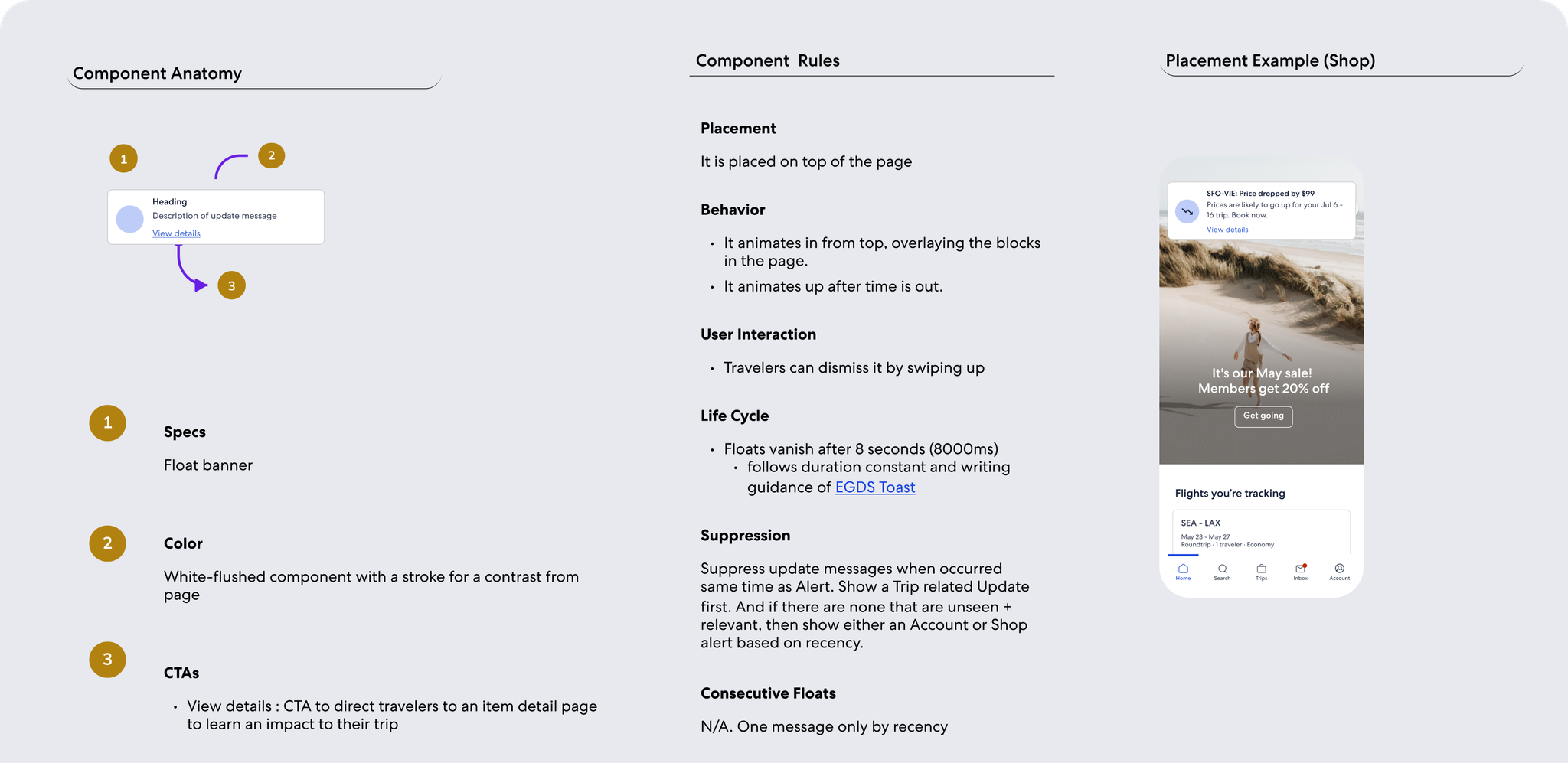
  2. Floats: in-app 'push' notification that gets the user's attention, for med priority messages like refund status
  3. Messaging Cards: isolated, noticeable element on page, for lower priority messages like car pickup reminder
  4. Embedded, contextual copy: for lowest priority messages that serve more as acknowledgement, for messages like change confirmation
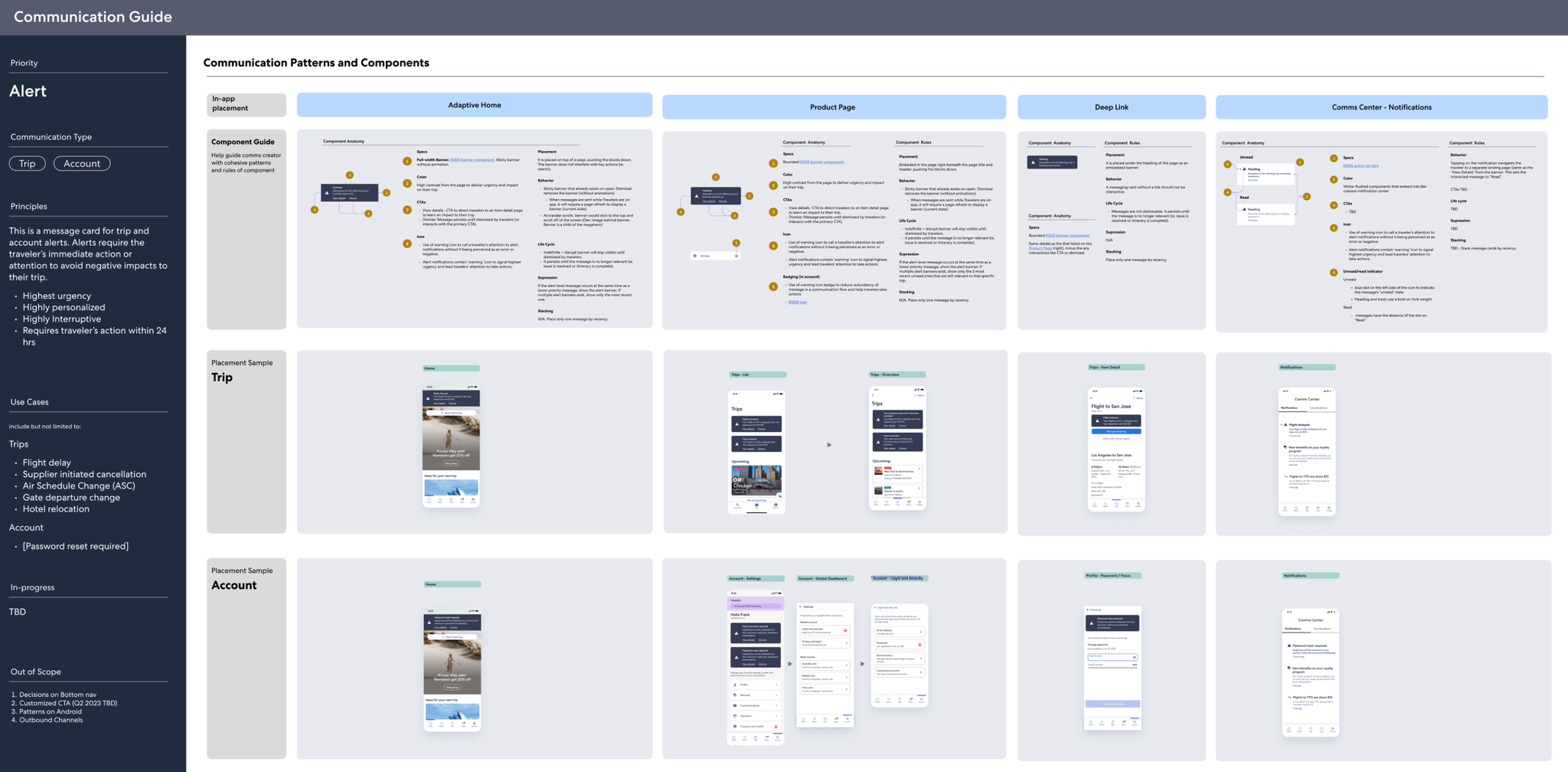
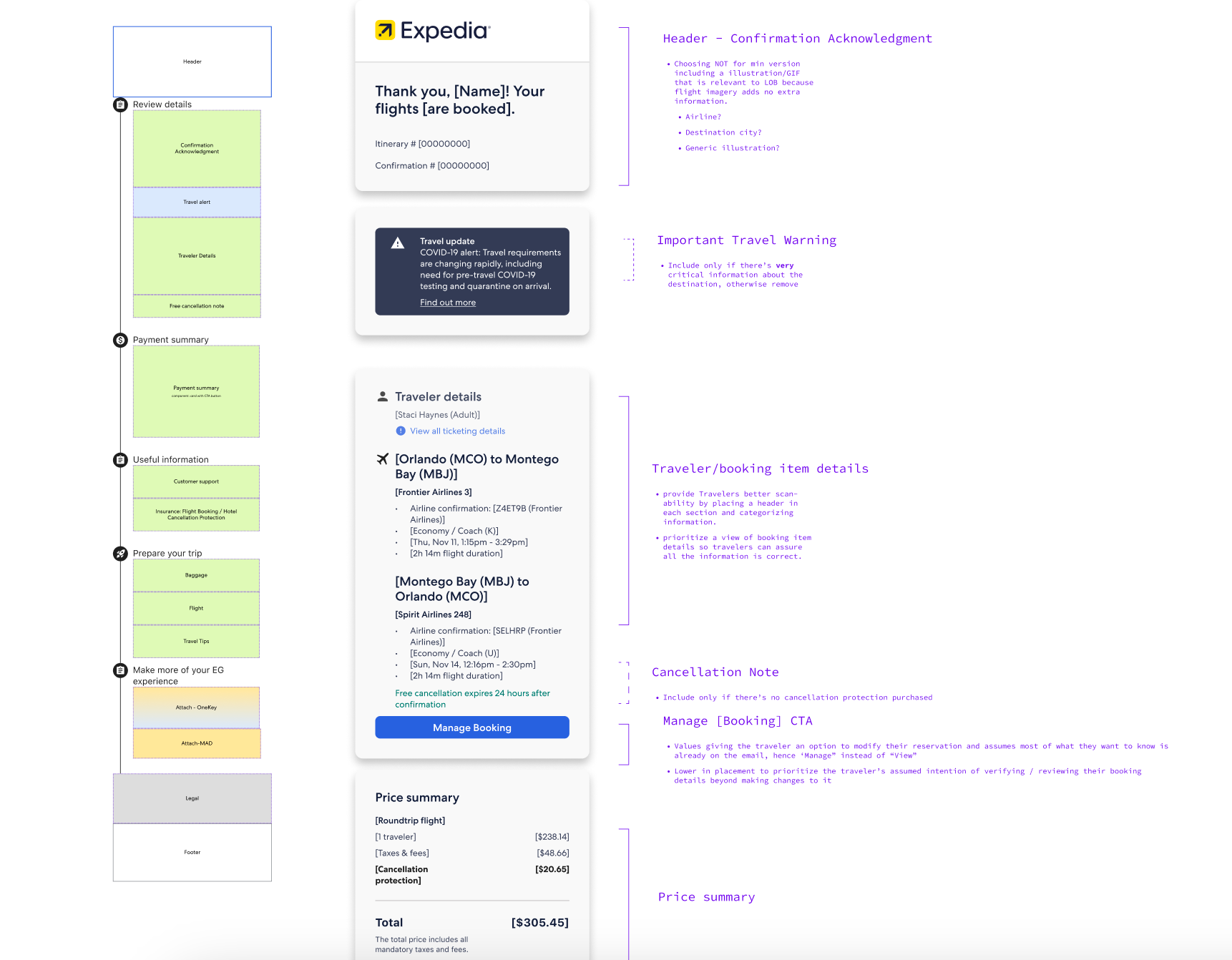
Examples of playbook sections for different design patterns displaying higher priority messages.
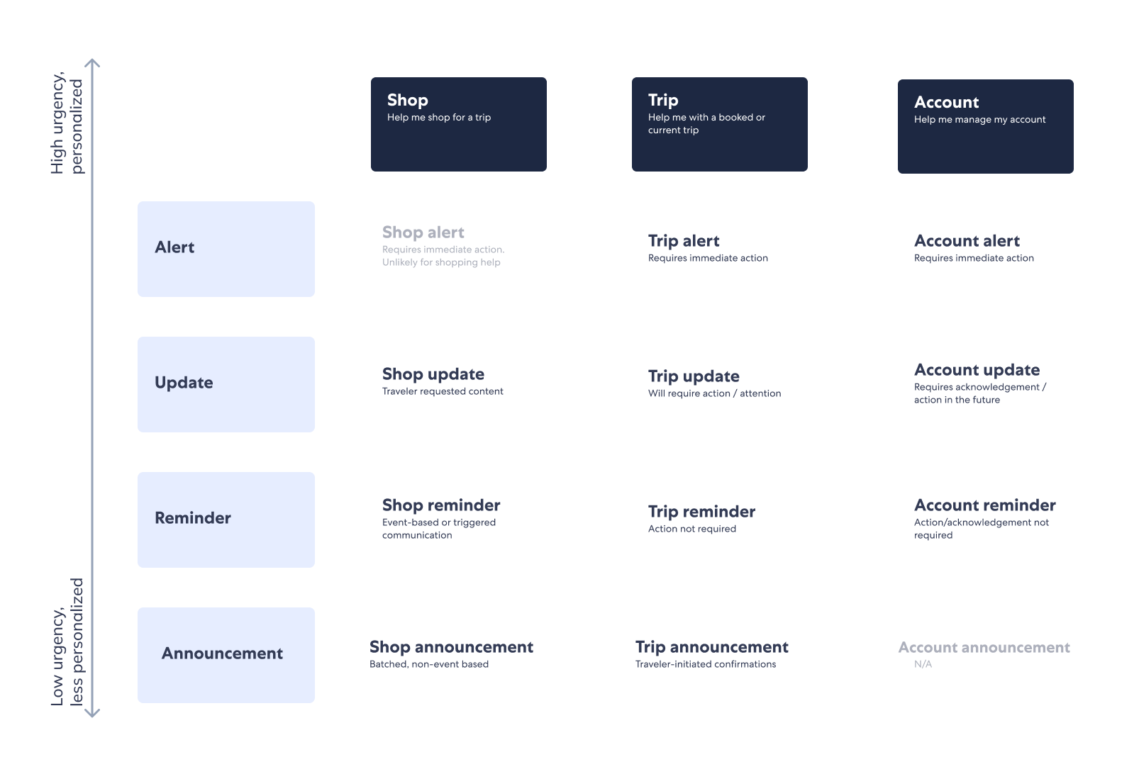
Communications Governance
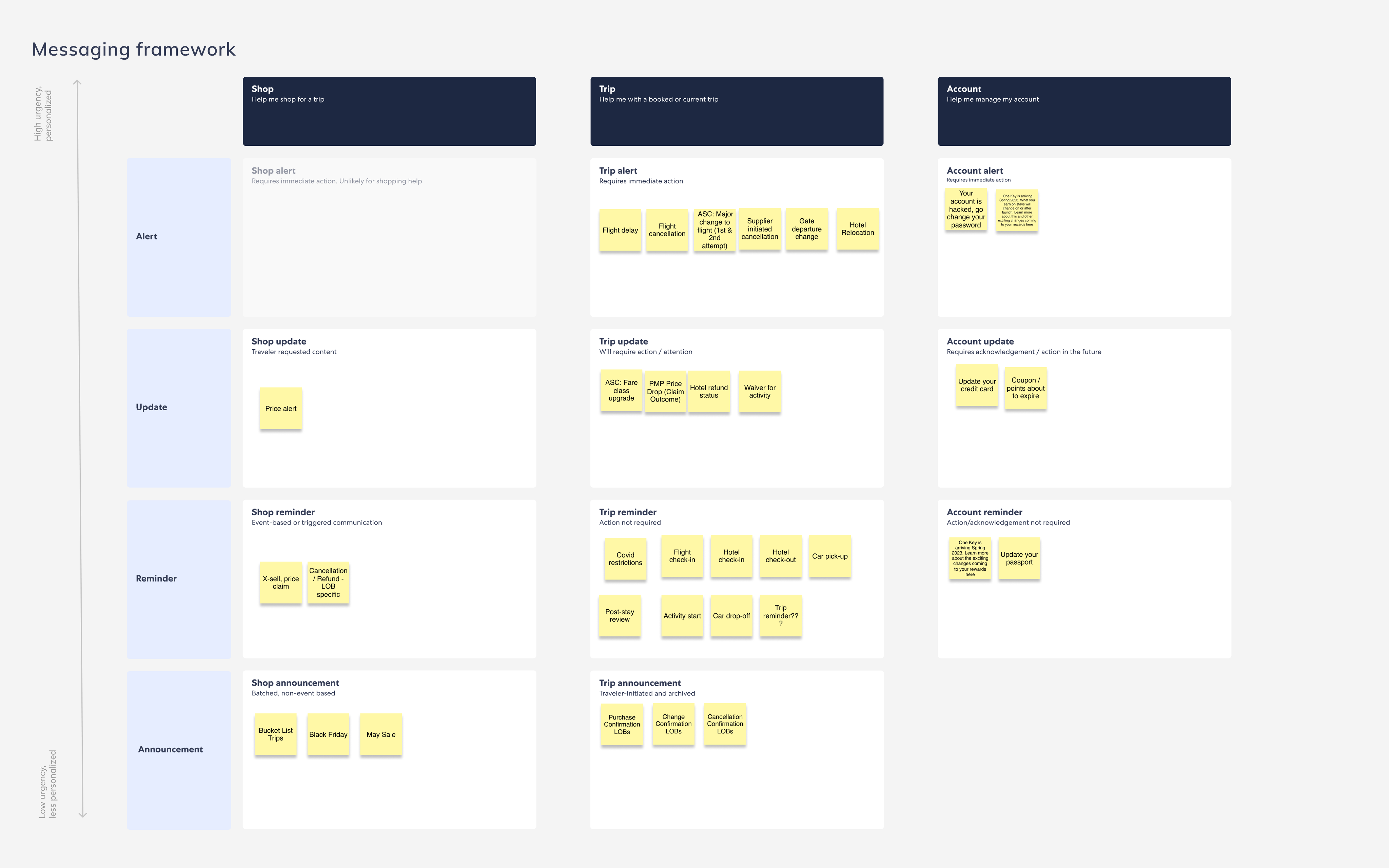
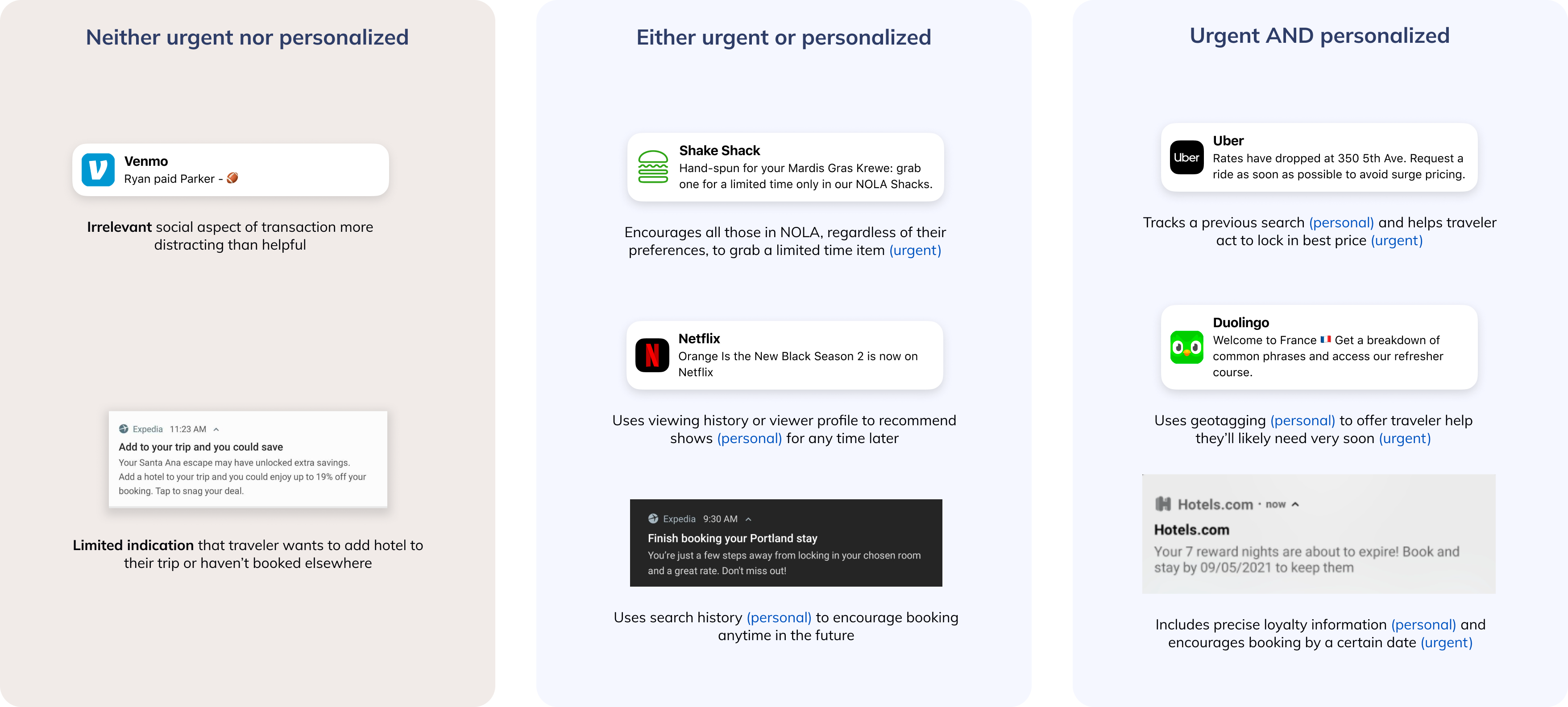
Based on user research, card sorting user exercises revealed travelers group EG communications into the buckets of "Shop", "Trip", and "Account".

Based on importance and urgency, communications are sorted into 4 levels of priority.

Through iterations, a simple matrix approach evolved into a more detailed decision tree.

Design - Communications Strategy

Email Design: Monetization Module Integration
Purchase Confirmation emails are the third-highest converting type of comm, driving 13x the conversion of marketing campaigns.
Expedia Group estimates a $6-9.5M GP from optimizing attach placements and improving conversion on transactional emails. Below are 3 explorations of what proportion of the email should be dedicated to business-oriented modules.
Standardizing email modules is also crucial in making EG branded emails look polished and cohesive. Plus, this would greatly increase creation efficiency and scalability.
Examples of attach modules include mobile app download, upsell (ie seat upgrades or insurance purchase), etc.
To modularize emails, each section's job-to-be-done is isolated and thoughtfully evaluated within the comprehensive email visual hierarchy.
Mobile Push Design
The mobile push channel offers traveler value in broadcasting important trip updates. This channel is critical to the business because of the strong correlation between push engagement and app retention.

I conducted OS and industry best practices research for the push channel. Select insights are: 
  • iOS vs Android - Understand behavioral differences between major mobile OS.
  • Landing Experience - Meet travelers expectations of landing experience after interacting with push.
  • Timing - Push messages should be relevant and lean towards the more urgent side.
  • Rich Push - Increasingly popular OS capability to incorporate greater interactivity and visuals for mobile push messages.
Exploration with OS-enabled rich push
Based on industry best practices and company goals to increase app retention, our team defined greater opportunities to:
  • Identify quick fixes to EG's as-is push experience like broken links and inconsistent landing pages
  • Remove or modify push messages based on the holistic experience along traveler journey
  • Find opportunities to add or enhance pushes according the best practices of the industry

What I Learned

  1. Design to influence - As our Comms team officially owns the communications experience but no actual communication, our design recommendations must reach and persuade the right people in order to influence change.
  2. Take initiative and iterate - With such an ambiguous project, it's crucial to take strong hypotheses forward and make progress rather than wait for perfect alignment.
  3. Design in systems - As this project is not singling out any one line of business or flow, it's important to visualize the sheer scale of the communications experience to make a point. Frameworks like journey maps or system diagrams help a lot.

Meet the Team

Ruochen Wu
UX Designer
Nayeon Lee
UX Designer
Mais Qumsieh
Product Manager
Grace Swanson
Content Designer