Goodreads
APP REDESIGN
DESCRIPTION
Evaluating what Goodreads Android users value in their experience and redesigning the app's numerous screens and features accordingly.
When
Apr - May 2020
I've always been an unabashed bookworm. Over the years, Goodreads was my tool for recommending and managing my readings. My experience is far from unique. A 2019 evaluation totals 80 million total users (50 million monthly) and a trove of 2.3 billion books listings, making this platform quite the depot for readers. This platform brings countless merits! But many readers, designers, and I can all agree there is room for improvement. A note that the focus of this project will be from the reader's perspective (not the publisher's or author's) and centered around the android application. I chose this platform both because of its larger user base and weaker experience for Goodreads (the iOS app is much better received).

Research

Research fell into two pools:
1)  Primary research through online surveys sent out to a design group and friends
2) Secondary research from Goodreads forums, Reddit groups, and design blogs

60% of my survey respondents preferred the web interface and 30% used web and mobile interchangeably, leaving only the remaining 10% favoring the app. However, Goodreads would benefit from improving its mobile experience. Surveyed Goodreads users go against the trend of increasing mobile share of traffic (53.3% in 2019). This shows that either Goodreads has an exceptional web experience or more likely, the app has not reached its potential. The Goodreads app has over 10 million downloads on Google Play, yet the 3.8 rating leaves more to be desired.​

From my research, I found user input fell into these buckets:
  • Search
  • Recommendations
  • Community
  • Organization
  • Review
  • Appearance
Although each Goodreads 'feature' has its strengths and weaknesses, I wanted to prioritize the categories that users access more frequently and value more. To do that, I looked into how and why people would use the app.
Insights:
  • On a reading journey, readers tend to use Goodreads for the beginning and end - not the middle
  • Users prioritize personal rather than social components of the app
  • Goodreads offers a myriad of features, many of which users do not find useful  
Priorities:
  • Recommendation - personalized lists based on past readings
  • Explore - curated lists for a general audience
  • Shelving - tracking of books, standardized Currently Reading, To-Read, and Read
  • Review/Rating - evaluate how others enjoyed a book - this is already well designed in the Goodreads app and I will not be making many changes except through adding ratings to more places Low Priorities
  • Friends/Groups - updates social aspect already exists in reviews; friend (and occasionally group) updates are nice-to-haves but users generally don't seek them
  • Intermediate progress updating - book-specific actions usually take place before starting or after completing the book
And from these results, I built Personas to conceptualize how users with contrasting reading styles would interact with the app. Meet our Book Lover and Sporadic Reader!

Design

All earlier investments lead to this, the design!​

Wanting to keep to the Goodreads brand, I kept with the original color palette or predominantly greens and tans. Goodreads has an old-school, comfortable feel in its design. And although there are millions of records in its database, the interface offers a comparatively limited number of actions (even fewer that is frequently used).

​I kept these principles in mind while making some enhancements to Goodreads.

Home

As the first screen to show when the user access Goodreads, Home is a crucial part of the user experience.
Redesign
  • Allows user to easily update progress and shows annual book count (features that were originally out of sight out of mind)
  • Friend updates are a nice bonus rather than the focus
Original
  • All about friend's updates  when reader's own books should be prioritized​
  • Aesthetically, the tan header plus rectangular build creates a more aged feel

Shelves

Shelving is a huge component of Goodreads (according to 70% of my respondents). The Book Lover would especially find use in this function, as this person churns through numerous books and has a greater incentive to organize them. However, the old shelving system takes an unnecessary extra step to access:

1)  Go from Updates (Home) -> My Books
2) Click on your specific shelf
3) View shelf

Plus, one Goodreads user specifically expressed that it "is not evident that we could create our own shelf".
Redesign
  • Shelf options are all laid out on the header
  • Friend updates are a nice bonus rather than the focus
  • Can edit multiple books' shelving from a holistic shelf-level
  • Shelf-specific calls to action (ie sharing and rating for books Read shelf)
Original
  • Not Intuitive how to add new shelves  
  • Each shelf has an identical design with no unique calls to action

Recommendations

All readers surveyed remarked they use Goodreads to find the next book to read, and 70% of them specifically make use of the recommendation feature. These, unlike Explore books, are personalized based on the reader's tastes. On the app, the user is recommended based on a favored genre or specific he or she read previously read.​

While a Sporadic Reader would get a lot out of a curated list (Explore), a Book Lover need would need targeted recommendations to hit specific reading cravings.
Redesign
  • The app accumulates books through multiple genres the reader completed and builds a personalized list through AI
  • The user can provide feedback for the recommendations based on adding it to the want to read list or disliking it
  • Book and genre recommendations are clearly separated
Original
  • Proportions of books on screen do not best occupy space
  • Should not have the option to rate books that are recommended but unread
  • Recommendations based on books and genres blend together

Explore

60% of those surveyed responded that a curated list for the community is something they value.To one, it feels "like 100 lists telling (him) to read ‘The Handmaid’s Tale’ and ‘Harry Potter’.” Another user expressed that "Goodreads seems to attract an audience of people with insanely bland and entry-level taste.”​

The insight here is that these lists can be generic or incompatible with the reader's taste.

​For someone who read less frequently, a list containing widely acclaimed books would be the best start. If a Sporadic Reader is able to find the right list (leading to the right book), then it would be a huge victory.
  • User can see the top lists but also search for specific lists based on keywords
  • The genres were enlarged and associate with a graphic (more descriptive than a color)
  • News and Interviews is front and center though it does not seem to be widely used​
  • No list search field so user must find the list by category
Redesign
  • The interface is much simpler with only adding a book or scrolling down as options
  • A large button calls the user to see another list at the specific list or genre level
Original
  • Books themselves, the most important component, are squeezed to the bottom of the genre
  • Related genres  have limited use cases

Search

When a user has a specific book or author in mind, finding the desired result when searching it is exhilarating. But seeing cluttered or inaccurate results would do the exact opposite. As one of the most used features with text and barcode search, Goodreads should focus on making its text-based search as helpful as its barcode one.

​As one user detailedly explains, "you have to type in the whole title in its entirety and even then it’s not usually one of the top results. Or when you’re searching and as you type more letters of the title to be more specific, the book you’re looking for disappears from the drop-down options."
Redesign
  • Books, authors, and series can be separated to better define intention
  • Images are added to complement the name
Original
  • A low number of very mixed results show up upon search of a common word
  • No organization in the search results
  • All text when images could convey the book or author much quicker and clearer

Menu

A way to tie the whole Goodreads experience together is with solid navigation. In my opinion, the Goodreads menu has all it needs, and then some. My changes were to simplify the menu the most commonly used features, then ordering them in related clusters.
Redesign
  • Clustered menu items into:
    1. User's books
    2. Discovery
    3. Social
    4. Yearly
    5. Activities
    6. Settings
  • Tan coloring fits better with the Goodreads theme
Original
  • Menu text is pretty small
  • Numbers on right do not convey much
  • Groupings are hard to see against dark template, which is jarring against lighter themes found elsewhere

Conclusion

Redesigning Goodreads was an enjoyable experience for me since the platform had been enhancing my reading experience for years. From researching the app, prototyping designs, and integrating peer feedback, I went through several rounds of iterative improvements. This personal project allowed me to explore the milestones of user experience design on my own interests and terms. Over a couple of months, I grew to be more intentional as both a Goodreads user and designer.

​To all those who nudged the project forward, thank you!

What I Learned

User research is difficult to collect. I found that survey drops in larger groups are ineffective compared to direct messaging within my network. Plus, it is challenging to uniform answers as question wordings can be interpreted quite differently. I learned the value of diverse research techniques that supplement thorough secondary research with sparse, but more targeted primary research.

​​On the design side, I received good feedback to keep the mobile experience in mind when designing on a laptop. It is crucial to consider accessibility and legibility, using standardized sizing and colors to allow for pleasant user experience. The simplicity of Goodreads principally required me to remove some features on my redesign, and really allowed me to assess the purposes of each feature.

I hope you enjoyed reading this case study...and your next book!

Other Projects

Expedia GroupCOMMUNICATIONS STRATEGY & DESIGN
DESCRIPTION
Enhanced Expedia Group's communications experience to elevate the travelers' experience across all stages of their user journey, boosting trust, and improving app retention.
When
Sep 2021 - Present
UX Designer
  • Recommend opportunities to add revenue-generating marketing attach modules to visible transactional emails
  • Identify gaps in the mobile push user journey including: missed push abandon cart opportunities  and deep links that need to be fixed
  • Create in-app communications governance standardizing UI patterns, placements, and behaviors

Impact

$6 M
Estimated revenue per booking increase by enhancing informational and monetization attach modules in push and transactional emails
2%
Boost 6-week app retention by governing traveler-facing messages' UI elements, behaviors, and in-app placements

Project Goal

Increase revenue

Improve brand loyalty

Boost app retention

KPI: Revenue per booking
KPI: App 6 week retention
KPI: Repeat booking, Cost savings from help center

Providing personalized and relevant recommendations enables Expedia Group to provide more value to travelers.

Users who enable app notifications upon installation open the app 2.78x more

Presenting the right message(s), at the right place, right time helps guide more seamless trips and bolsters brand loyalty.


Discover - Comms Ecosystem

Historically, communication owners at Expedia Group created content and visual patterns to suit their ad-hoc and specific needs. Over time, this made the Expedia Group (EG) communications experience disjointed and challenging to scale.

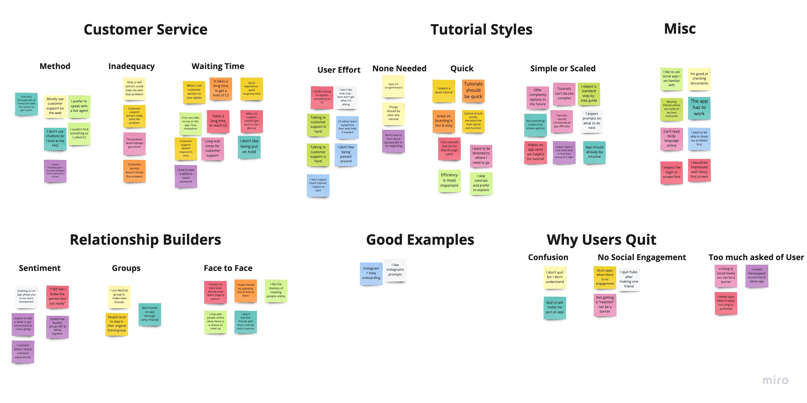
Before evolving EG's communication experience, our team audited the current comms environment to identify:
  1. What communications are sent today?
  2. What channels, internal and external, do these communications surface?
  3. What are the technology and platforms power these communications?
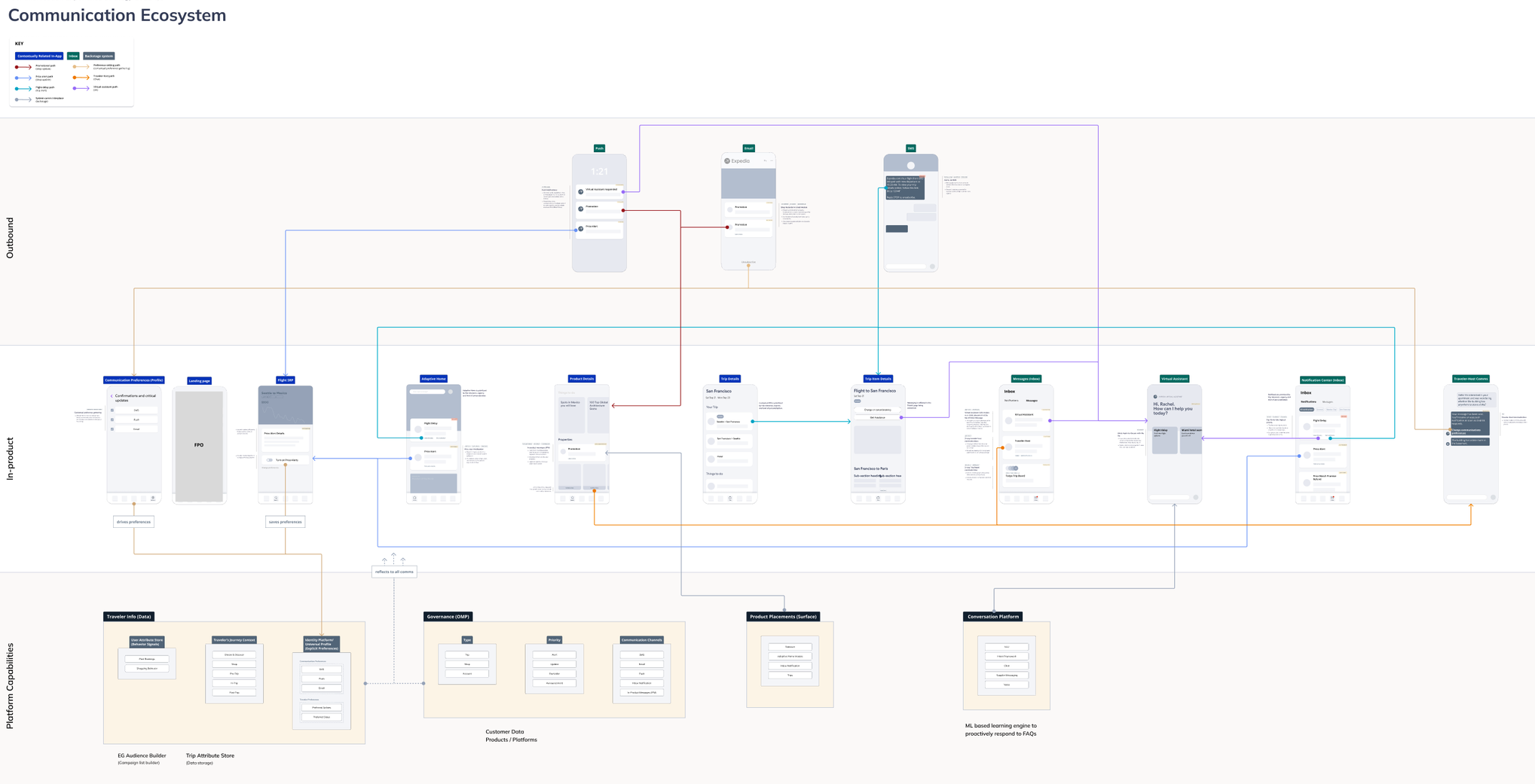
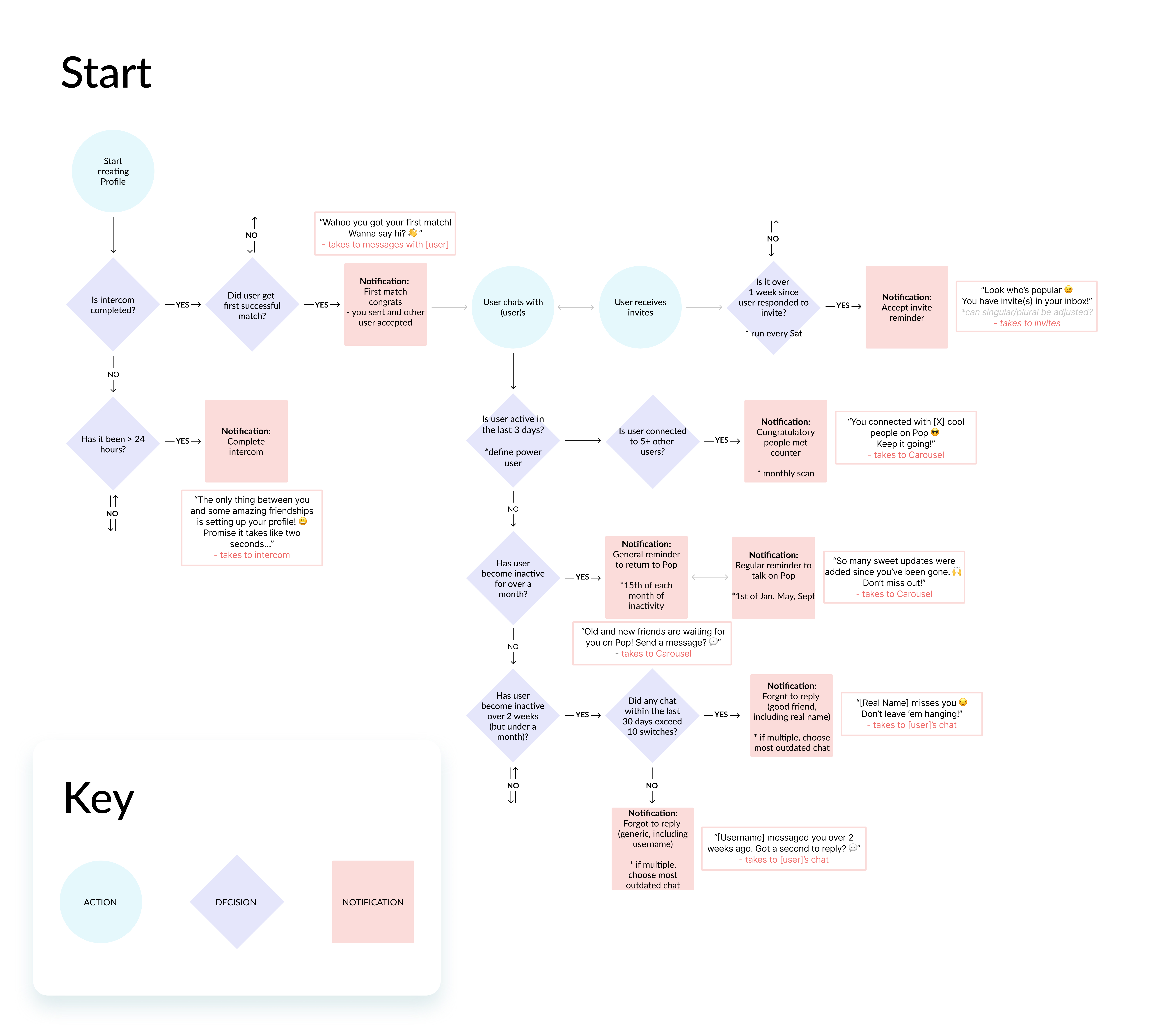
Current-State Communications Ecosystem Map
Collaborating with Product and Content design partners, we defined the north star of what an ideal communications experience entails.

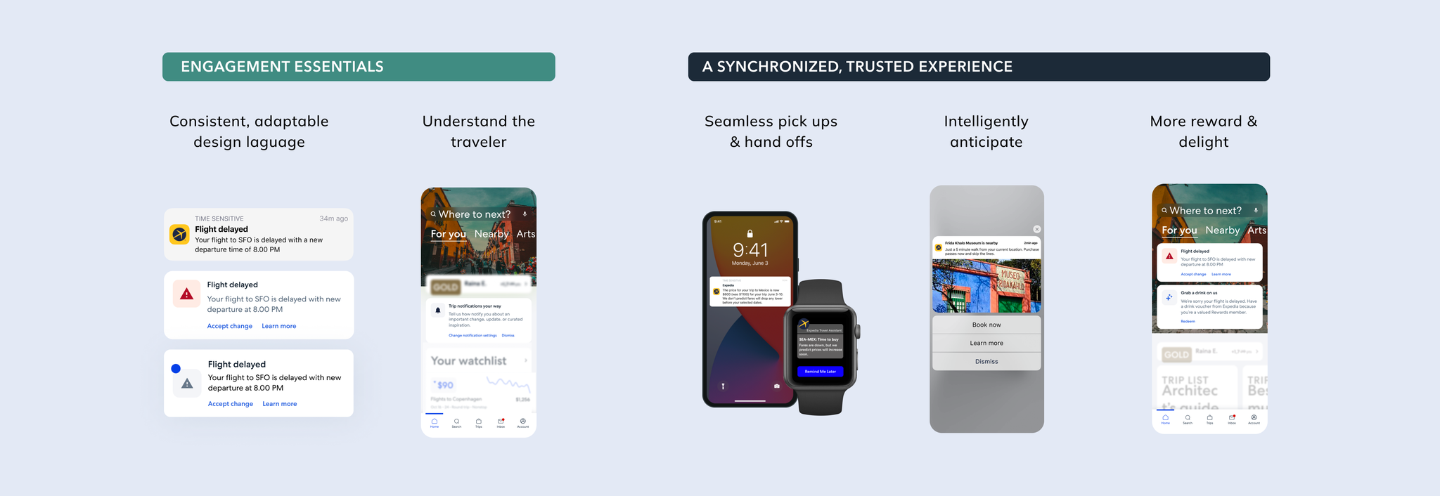
Design - Communications Strategy

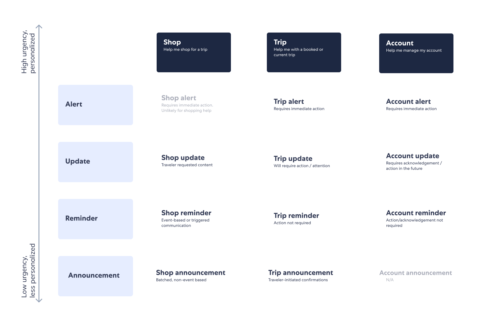
Communications Governance
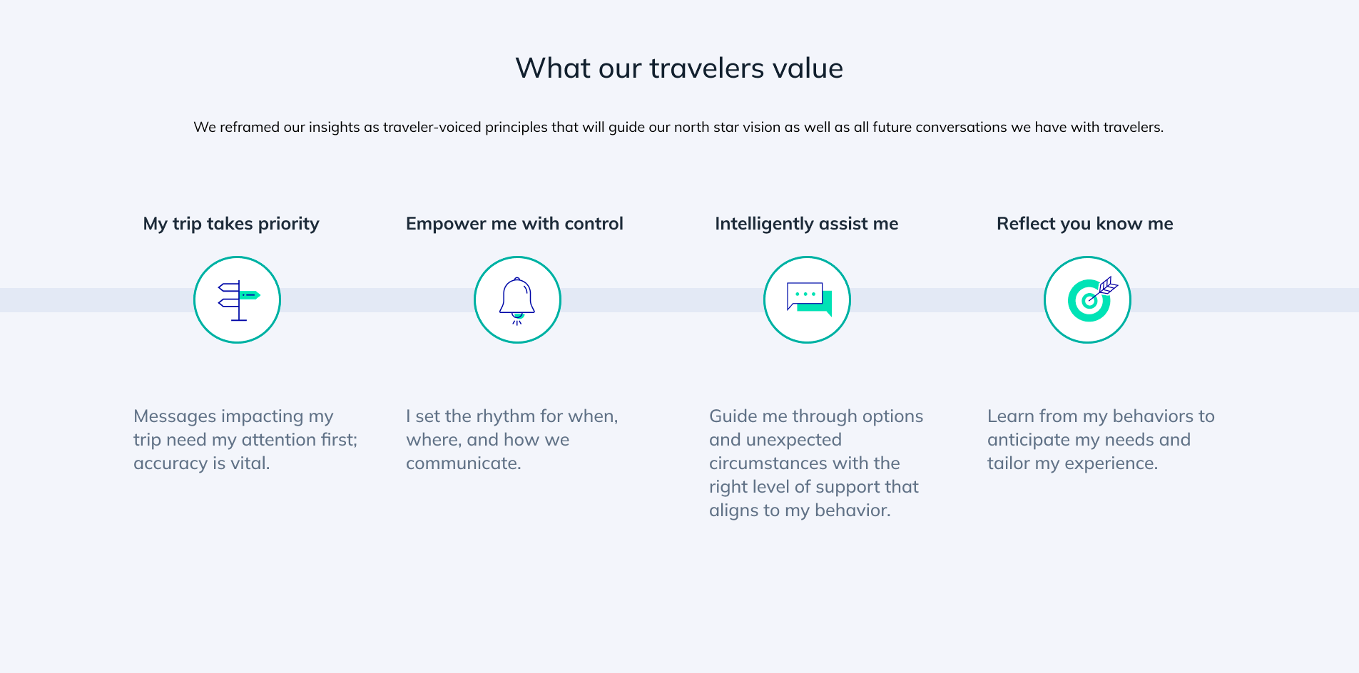
Based on user research, card sorting user exercises revealed travelers group EG communications into the buckets of "Shop", "Trip", and "Account".

Based on importance and urgency, communications are sorted into 4 levels of priority.
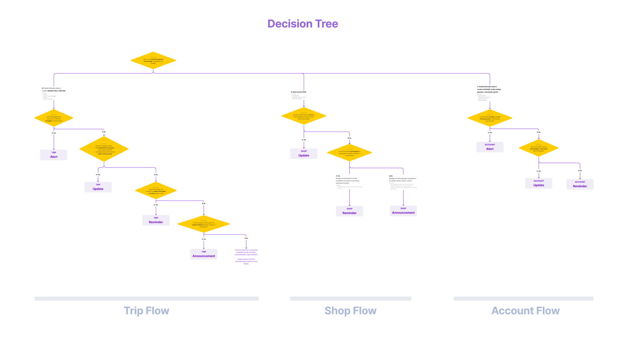
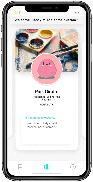
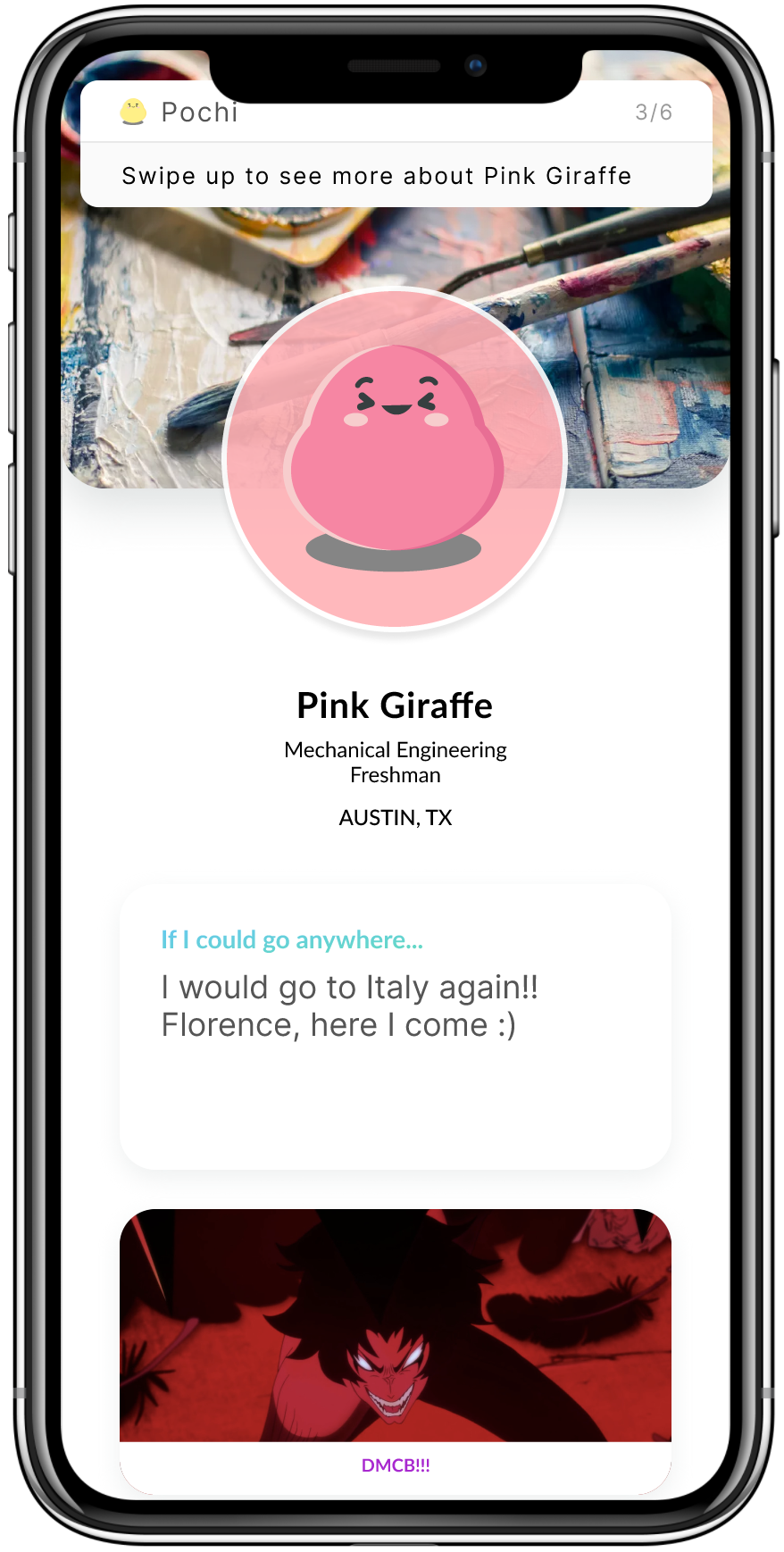
Check in to hotel (example)
Message Type: Trips
Disruption
New or unexpected information
Help current or future travelers plan trips  ✓
Result: Trip Reminder
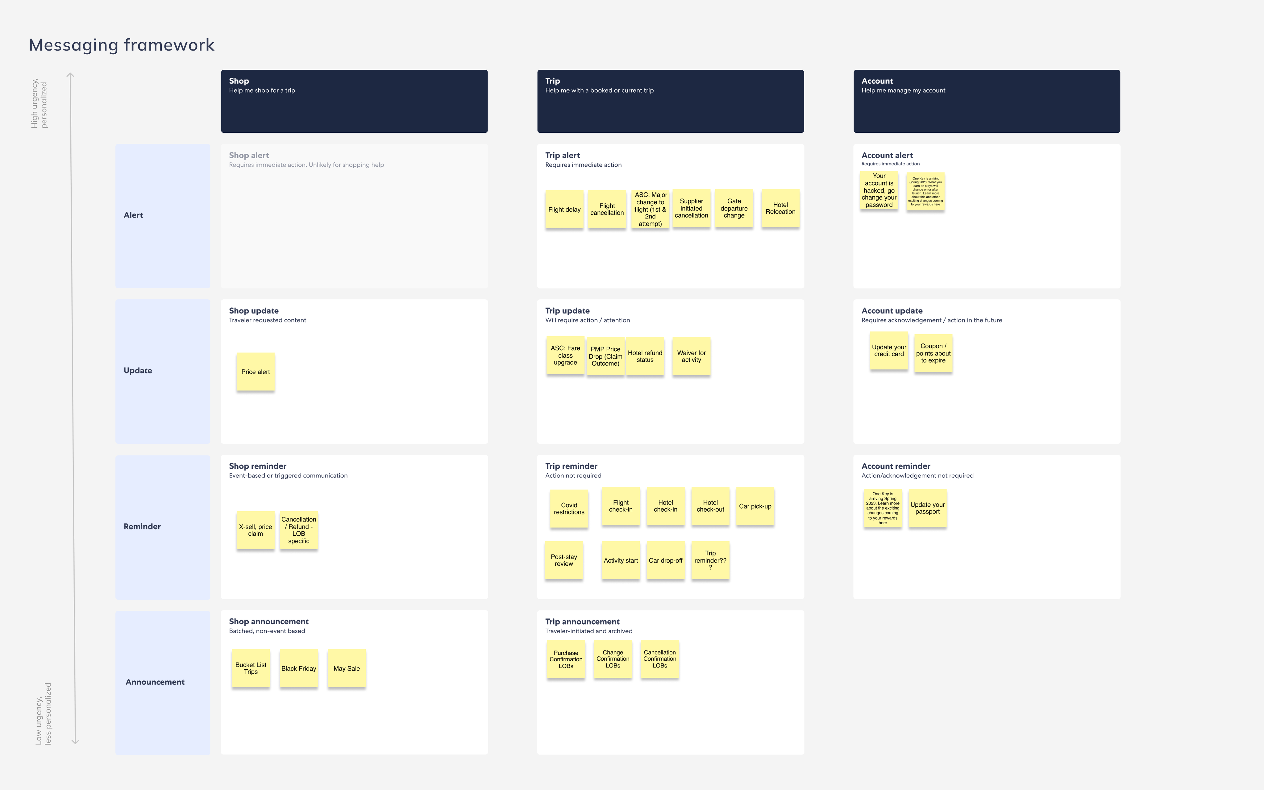
Based on visual priority, specific patterns and placement behaviors were recommended as the standard. For instance:
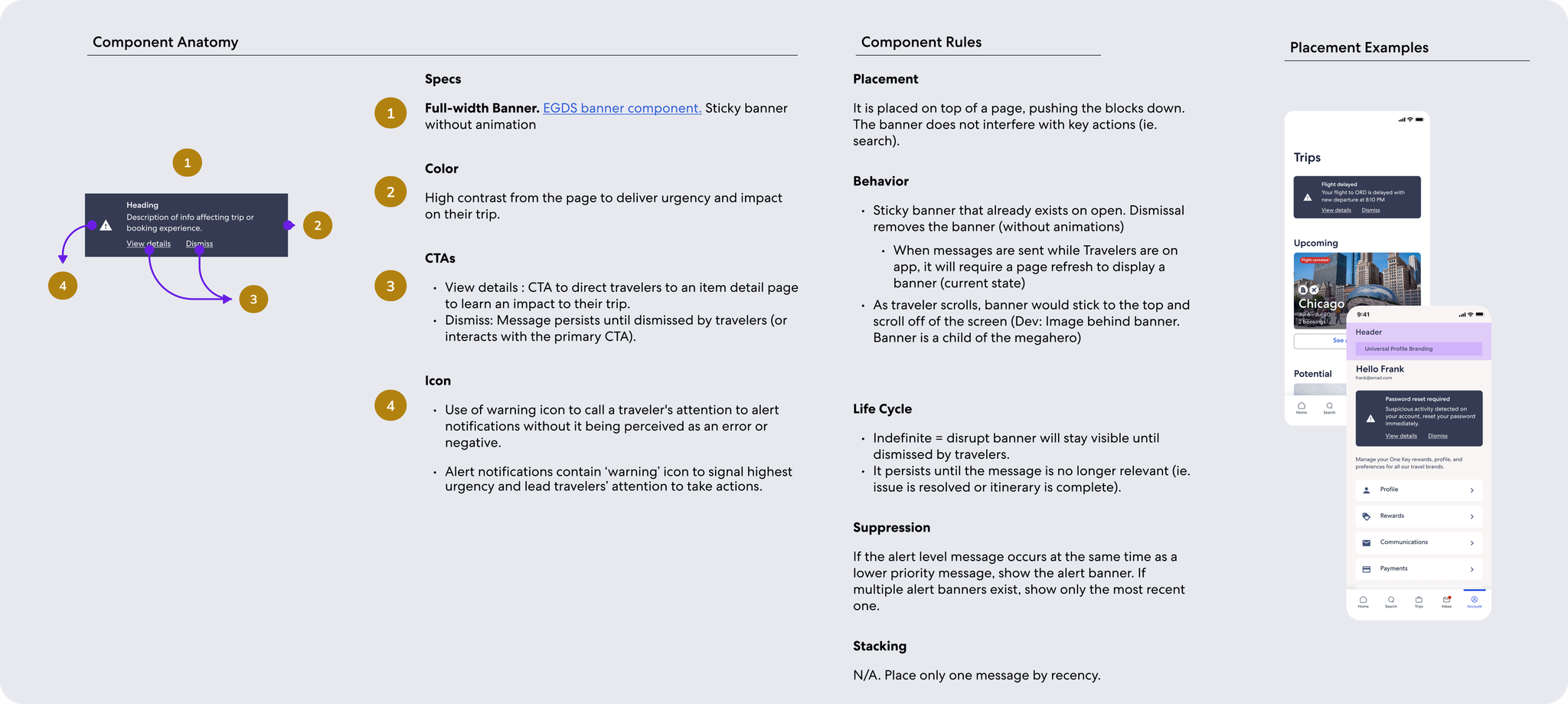
  1. Dark Banners: high contrast component that requires explicit dismissal or action, for highest priority messages like weather alert
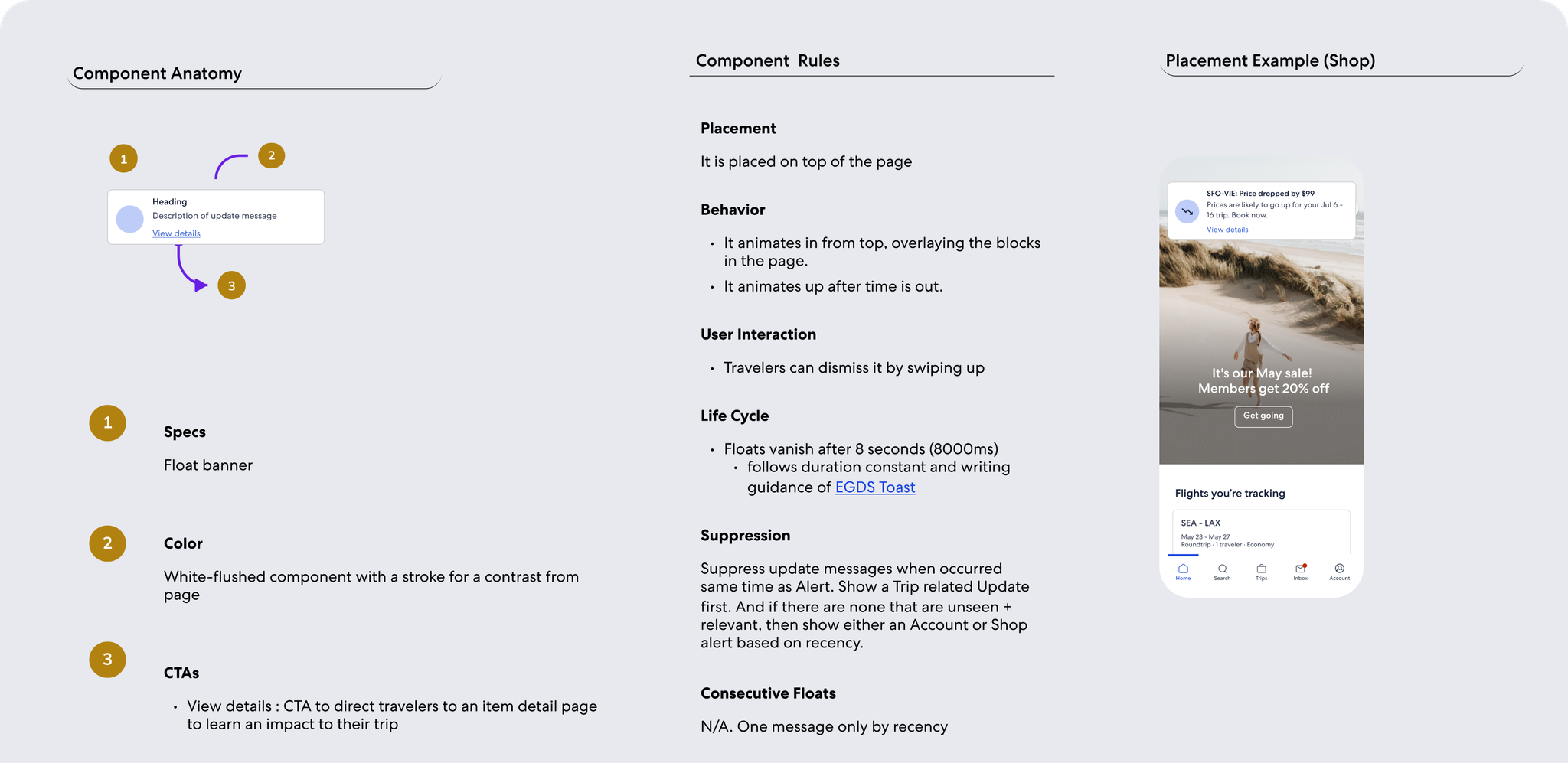
  2. Floats: in-app 'push' notification that gets the user's attention, for med priority messages like refund status
  3. Messaging Cards: isolated, noticeable element on page, for lower priority messages like car pickup reminder
  4. Embedded, contextual copy: for lowest priority messages that serve more as acknowledgement, for messages like change confirmation
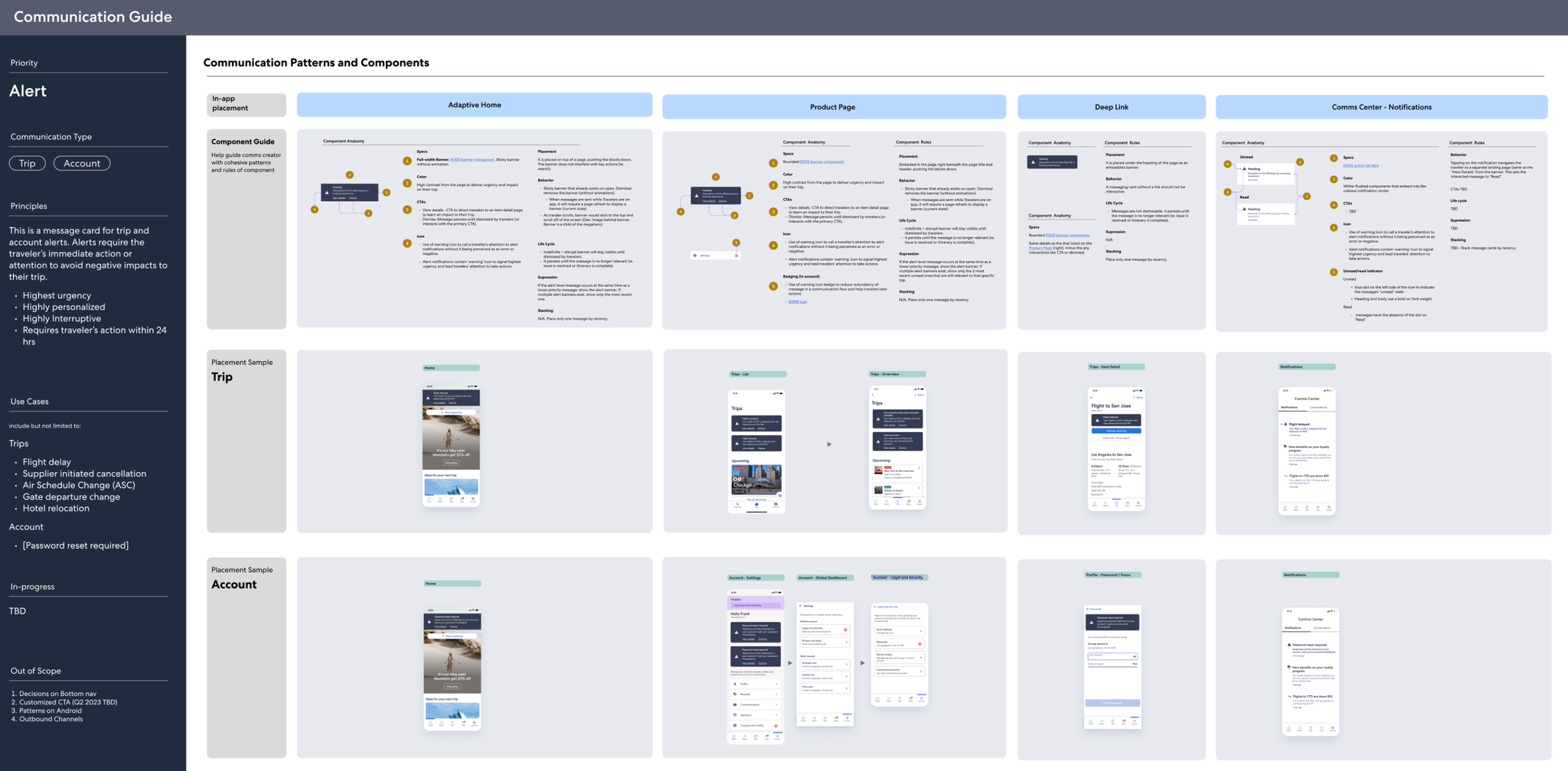
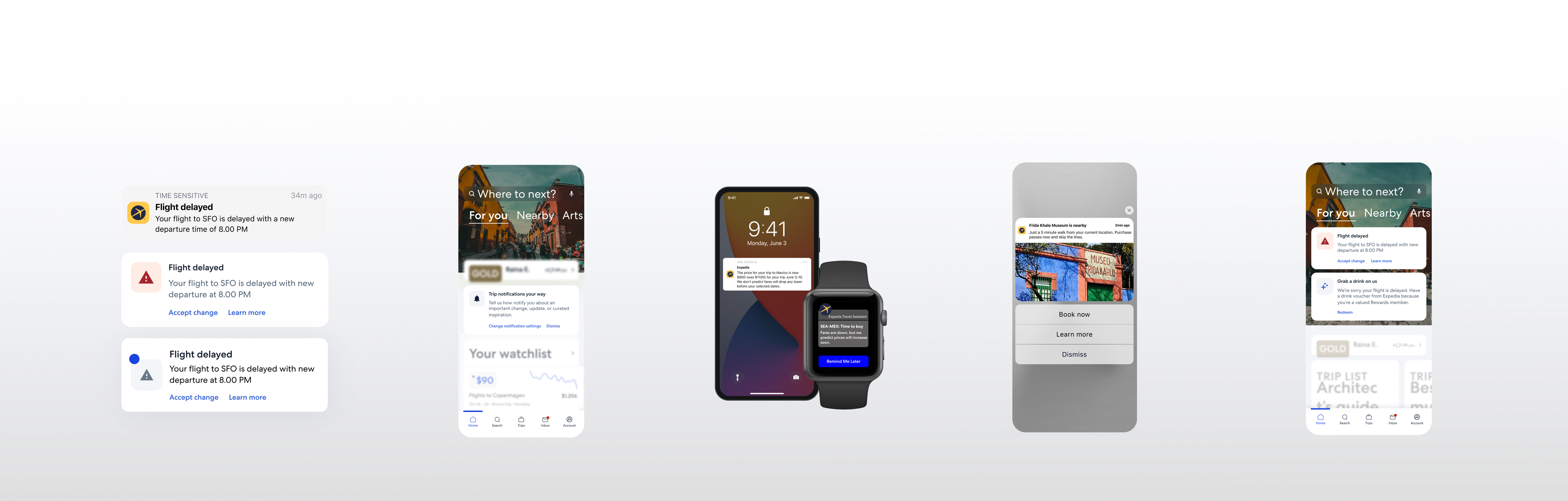
Examples of playbook for different design patterns used for the higher priority messages.
Mobile Push Strategy
The mobile push channel offers traveler value in receiving important trip updates and brand values. This channel is critical to the business because of the strong correlation between push engagement and app retention.

I conducted OS and industry best practices research for the push channel. Select insights are: 
  • iOS vs Android - understand behavioral differences between major mobile OS
  • Landing Experience - meet travelers expectations of landing experience after interacting with push
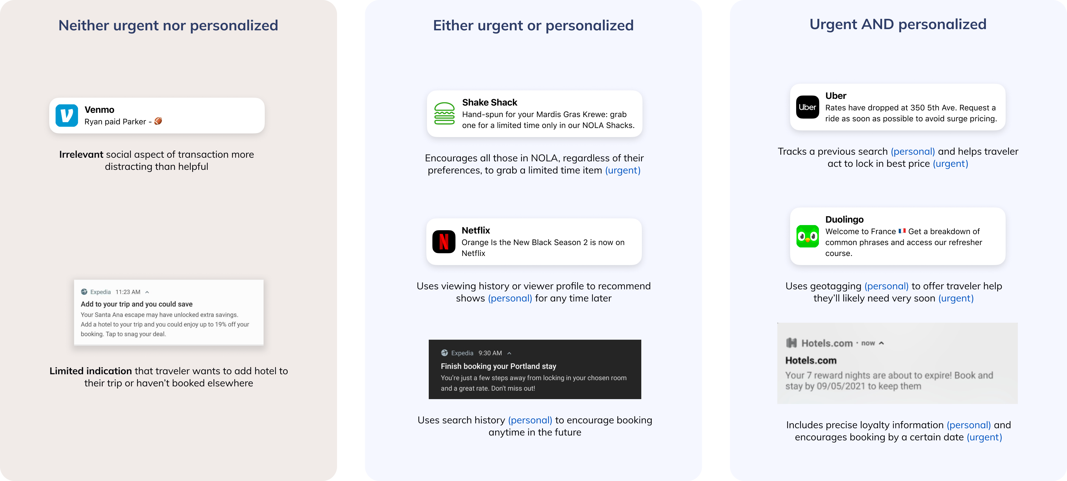
  • Timing - push messages should be relevant and lean towards the more urgent side
  • Rich Push - increasingly popular OS capability to incorporate greater interactivity and visuals for mobile push messages
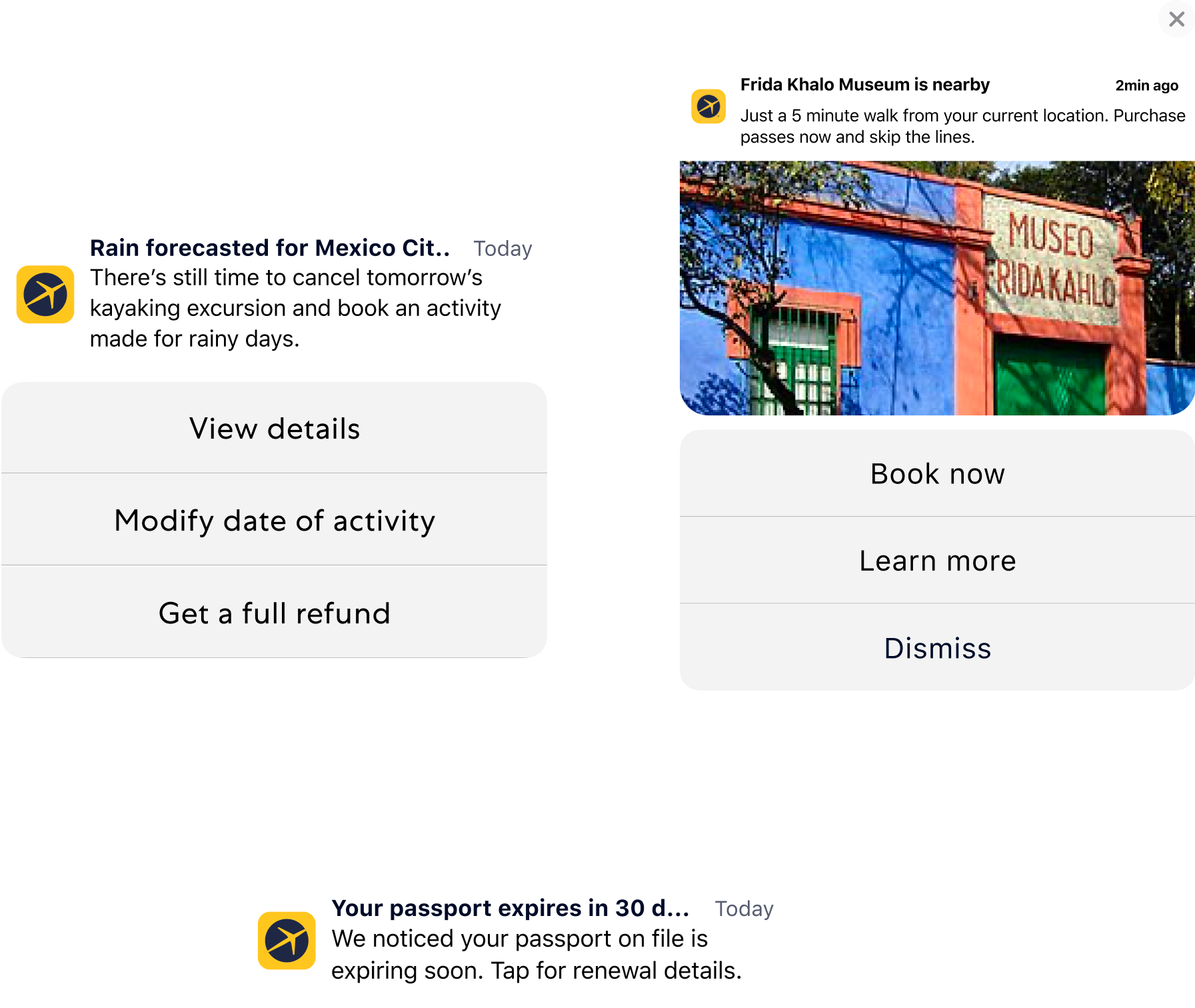
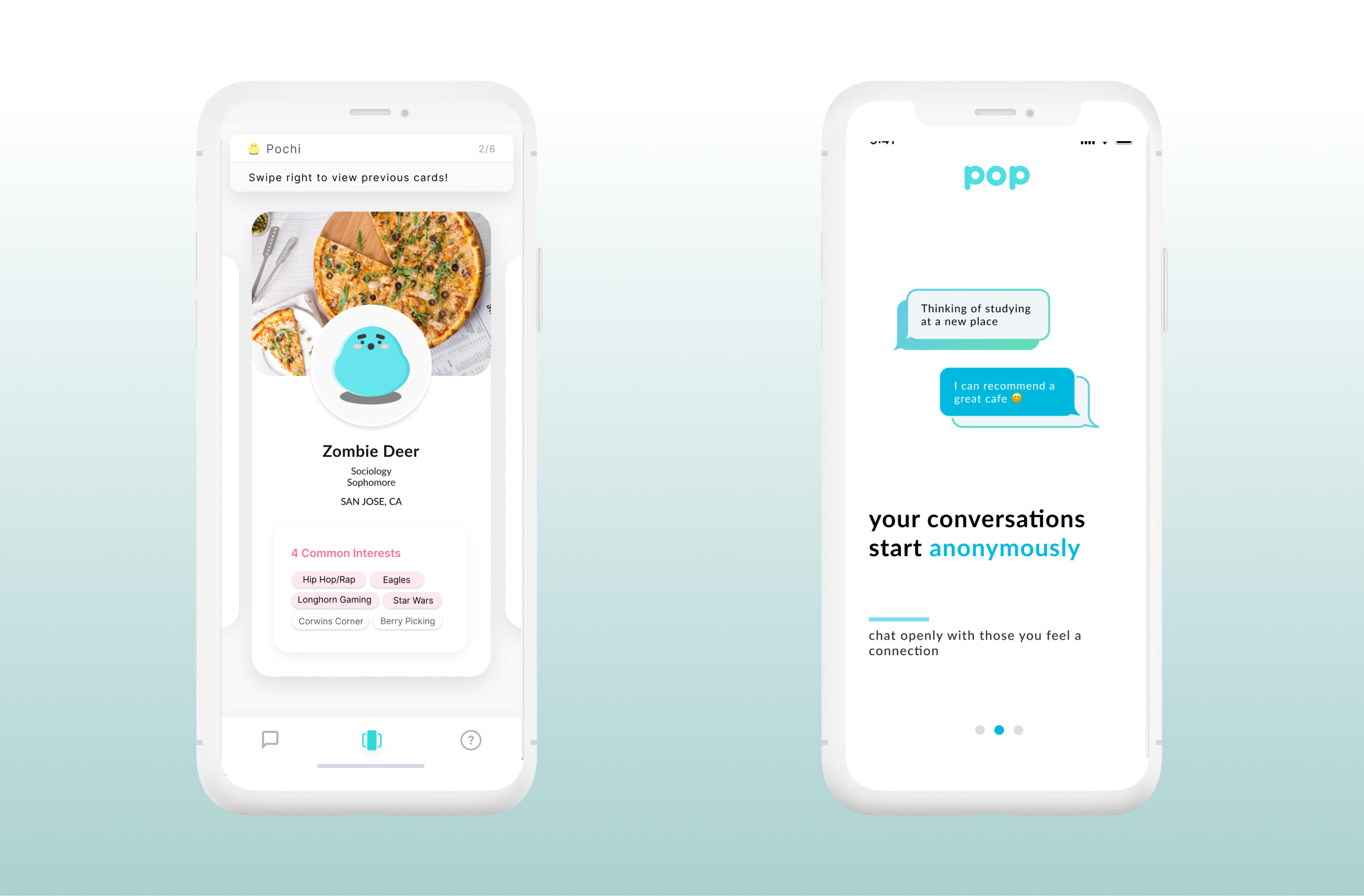
Exploration with OS-enabled rich push
Based on best practices, our team defined greater opportunities to:
  • Identify quick fixes to EG's as-is push experience like broken links and inconsistent landing pages
  • Remove or modify push messages based on the holistic experience along traveler journey
  • Find opportunities to add or enhance pushes according the best practices of the industry

Define - Comms Ecosystem
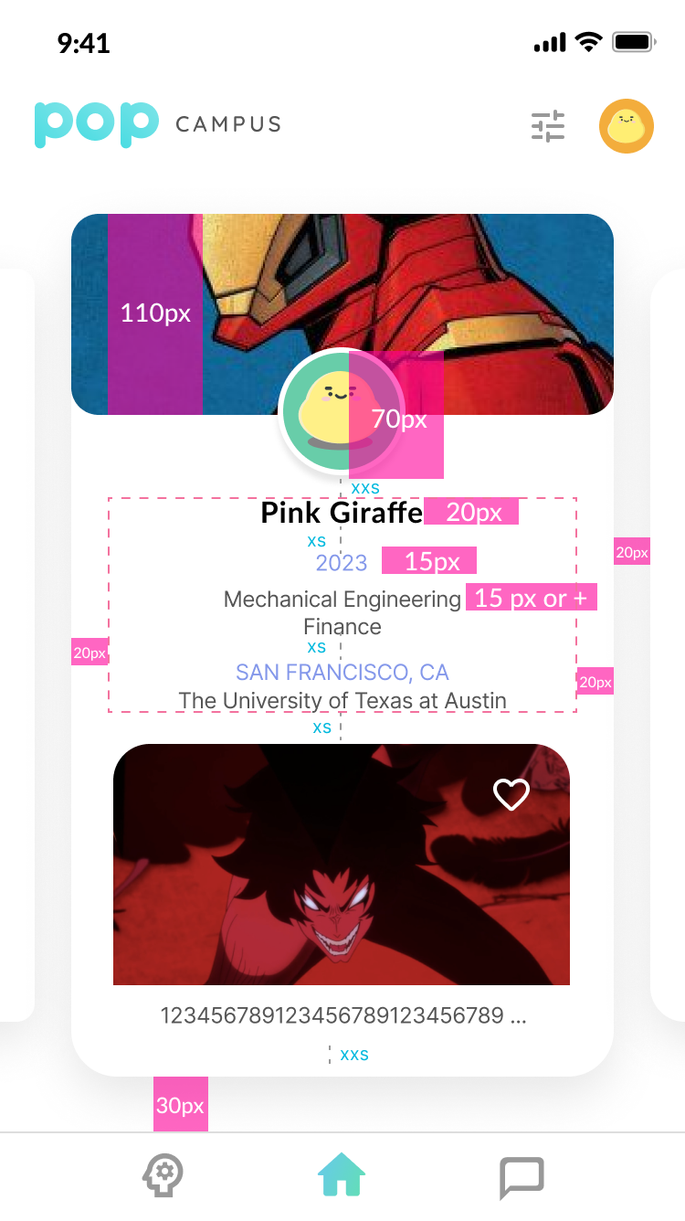
Email Design: Monetization Module Integration
Purchase Confirmation emails are the third-highest converting type of comm, driving 13x the conversion of marketing campaigns.
Expedia Group estimates a $6-9.5M GP from optimizing attach placements and improving conversion on transactional emails
* Examples of attach modules include mobile app download, upsell (ie seat upgrades or insurance purchase), etc.
Standardizing email modules is also crucial in making EG branded emails look polished and cohesive. Plus, this would greatly increase creation efficiency and scalability.
To modularize emails, each section's job-to-be-done is isolated and thoughtfully evaluated alongside the comprehensive email visual hierarchy.

What I Learned

  1. Design to influence - As our Comms team officially owns no communication but the entire experience, our design recommendations MUST reach and persuade the right people in order for influence change.
  2. Take initiative and iterate - With such an ambiguous project, it's crucial to take strong hypotheses forward and make progress rather than wait for perfect alignment.
  3. Design in systems - As this project is not singling out any one line of business or flow, it's important to visualize the sheer scale of the communications experience to make a point. Frameworks like journey maps or system diagrams help a lot.

Meet the Team

Ruochen Wu
UX Designer
Nayeon Lee
UX Designer
Mais Qumsieh
Product Manager
Grace Swanson
Content Designer
Morgan Stanley
IDEATION
WIREFRAME
WEB APP

Designed an innovative digital solution for employees to better connect information seekers and knowledge experts in the workplace. My roles included product management and wireframe design.

Learn More
Morgan Stanley
IDEA LAB
DESCRIPTION
22 competing teams
4 months | 5-10 hours per week​
When
November 2019 - February 2020
During a Morgan Stanley design challenge, our team ideated, designed, and prototyped on the question:

How might Morgan Stanley connect employees to existing resources to enable better ways of working?

Emphasize

To narrow down the scope of our problem, the team utilized three different research methods to better understand professionals in the industry. Our goals are to understand the issues they experience in their day-to-days and the types of resources and connectivity they value. Below are our most notable findings: 
User Interviews & Surveys
"As a senior employee, I am bombarded with so many information requests I do not have the time or resources to help with.”
"I wish for a platform to help employees network across departments."
Morgan Stanley Internal Interviews
"At MS to be successful you need to have a large internal network."
​"Collaboration tools are not uniform, so people aren’t sure how to communicate and to use what."
Morgan Stanley Information Packet
"CRM system is difficult to use as is sharing info; tend to resort to calling the lead for an account/contact."​
"No single way to share or access firm-specific information."

Define

Original Ask:
How might Morgan Stanley connect employees to existing resources to enable better ways of working?

Refined - team's reframe to narrow down to better target with a strategy:
How can we improve Morgan Stanley employees' access to and empowerment through workplace resources?

User Story - Current State
Identify who would is a user we want to create a solution for. One of our personas, Clarence Johnson, is shown here.
User Journey - Current State
Identify the pain points of our user's typical day at work.

Ideate

VR/AR conferencing
Fun and innovative, but little added value to traditional meeting experience.  

Location-based meeting set-up
Able to intelligently arrange meetings but significant privacy concerns.

Chatbot for questions -> Expertbot -> Hey Stan
In our ideation sessions, the team brainstormed what we wanted the Hey Stan brand to show:

Helpful
- engaging
- supportive
- approachable
- subordinate
- personable
- reliable
- trustworthy

Accessibility
- easy
- straightforward
- simple
- intuitive
- consistent
- anticipatory
Quirky
- no gender
- blue
- innovative

Reputable | Trust
- traditional
- hierarchical
- prestigious
- serious
- valuable
- reputable
- authority
- compliant
- professional
- analytical

Prototype

Color:
We aimed to integrate the Morgan Stanley color pallet to have our solution feel cohesive to the preexisting corporate branding.
Theme:
From the Morgan Stanley website, the team noted down stylistic themes.

- font: semi-bold and all caps for headings
- clean, few lines (except menu)
- few gradients
- rounded buttons
- white foreground on gray background
- many squares (photos), with nubby arrow
Color:
We aimed to integrate the Morgan Stanley color pallet to have our solution feel cohesive to the preexisting corporate branding.

Our Solution

Chatbot
  • Integrated with preexisting messaging platforms (ie Skype)
  • Follow-up questions clarify requestor needs
  • Request status updates
Invite Management
  • Integrates with Outlook calendar and email inbox
  • Details ask and requestor on meeting invite
Incentivized Participation
  • Karma points for completing request or connecting requestor
  • Points can be redeemed for rewards (i.e. gift card)
Personalized Dashbaord
  • Tracks Karma points
  • Manages skillsets
  • Shows networking history and context
Iteration 1:
Our preliminary mockup showcases the idea in two key screens: the paired meeting confirmation (top) and expert dashboard (bottom).
Iteration 2:
Though the prototypes aligned in color, the look and feel did not closely resemble Morgan Stanley's.
The team also aligned our solution with preexisting tools integrated with Hey Stan, like Skype and Outlook. We outlined how the separate prototypes are connected and determined that the Expert Dashboard will be a separate portal accessible through email, calendar, or chat links.
Skype Chat - Requestor
The requestor messages Hey Stan on Skype and confirms the meeting needs.
Skype Chat - Expert
The expert receives a notification based on skillset and availability compatibilities. Then the expert can either confirm or pass on the request.
Outlook Invite
The meeting request is emailed to the expert who can view the meeting invite in a familiar format. The expert has the option to accept the invite and schedule to the meeting, or decline it and pass the request onto another professional.
Expert Dashboard
The expert can view all aspects of Hey Stan in one place: past/present/future meeting requests, skillsets, and Karma points.
Expert Dashboard (Cont.)
Here, the expert can redeem awards according to his or her accumulated Karma points. Additionally, the History section allows the expert to easily track past meetings' participants and content.
My Connections
Forming new relationships across departments and geographies is much simpler with Hey Stan. Not only can the requestor and expert form connections using this solution, but each would be able to refer their new acquaintances to others in the network!

Test

To evaluate our solution, the team refined our solution iteratively with the help of our 4 IdeaLab mentors and a Morgan Stanley employee. Additionally, we presented it to the IdeaLab organizers in New York as well as spectators from Morgan Stanley leadership, receiving good feedback on use-cases and Hey Stan's merit.

What I Learned

Throughout the project, the team generated more ideas than could be executed. We iteratively checked in with our mentors to consider the feasibility of execution and benefits of the solution. Some ideas, like our AR meeting room, involved innovative technologies that ultimately did present a solution worth the investment. Areas to further investigate include acquiring buy-in from the subject matter experts who may have concerns with request overload as well as the usefulness of HeyStan after setting up the initial meeting.For our strengths, our team was very meticulous about Morgan Stanley branding and design cohesion. Additionally, the judges applauded our ability to present the chat feature through voice acting the distinct roles.

Our team ultimately learned a lot from the Hey Stan project - special thanks to our mentors, Morgan Stanley, and the EY IdeaLab team for organizing!

Meet the Team

Tyler McBride
Product Management Specialist
Neela Vahora
Technology Capabilities Advisor
Kyle Bransky
Customer Experience Designer
Cassandra Johnson
UI/UX Designer
Kim Perdue
Marketing Research Specialist
Ruochen Wu
Project Manager & UI/UX Designer

Other Projects

Pop
University Connection-Building App
DESCRIPTION
Design the experience of building genuine connections in college communities nationwide
When
July 2019 - Present
UI/UX Designer Role
  • Drive user-centric design incorporating user research and KPI prioritization
  • Wireframe and prototype designs iteratively using industry best practices
  • Document and adapt designs to development team capabilities and constraints

Impact

10%
increased onboarding completion
200%
user growth over 10 month period

Challenge

Pop is an app for college students to meet their classmates and develop genuine friendships through conversation.

But how do we communicate such a powerful message and the full fleet of the app's features to the users? The data team shared that a significant number of users did not complete onboarding.
"26% of our users did not finish onboarding. "
- Rick, head of Data Analytics team
Yellow (null) shows Users who did not complete onboarding
Our team's mission was to bridge the gap between the students who made an account and those who got to truly experience what Pop has to offer. Our hypothesis is that by sharing the what and how of Pop's offerings, we'll have more total users and a higher percentage who complete onboarding and have a full experience afterwards. We decided to tackle this onboarding issue via: opening screens (highlights Pop's purpose, tutorial (showcases Pop functionality), and Notifications.

Opening Screens

What is Pop and how do you condense the entire purpose of the app into 3 screens? 
To begin, we referenced our internal website and app store descriptions. We also consulted the marketing team to align on the branding. Ultimately, we landed on:
  • Your personality comes first - browse the student directory of those in your university via personalized profile cards
  • Your conversations start anonymously - base conversations on common interests without the presumptions of a name or picture
  • You decide who's interesting - build on the relationship meter through continued interactions

Tutorial

This necessity of a tutorial feature was evident after discussions with the data team. Firstly, there were qualitative comments from users, such as not realizing the user carousel can swipe backwards and forwards. For Pop, would mean fewer requests sent and less time spent on the app.

Ideation

The team collectively interviewed 7 users about their tutorial experiences and grouped their responses accordingly.

Design

Design created a style guide to promote a consistent and completeness in addressing branding as well as expected use-cases and states.
Early prototypes incorporated design strategies that our team ultimately decided against:
  • Grayed out screens - make our product look less bright
  • Too mascot oriented - introducing the mascot too early takes up space and disconnects from the message
Further iterations honed our designs to consider not only on the end user but also timeline and development team inputs.

For instance, some of the more sophisticated animations that required X, Y, and Z plane movement were scrapped after technical discussions.
The highlights of our later designs included: 
  • Animation - combination between animated swipe gestures and internal 'push notifications'
  • Negative Cases / Sandboxing - what the user can't do during each step
  • Conditional Skipping - depending on the order of actions taken, the User experiences a unique tutorial route
Example of different paths the user can take to complete the 6 tutorial steps
To communicate best with the development team, we marked our designs with precise measurements for all major mobile screen sizes.
Large and small screen size variations for home screen

User Interviews

We observed 4 users completing the tutorial prototype and followed up with probing questions. Their feedback revealed that:
  • Opening Exploration - reduce initial unguided sequence intended for users to freely explore
  • Pacing - short and sweet enough that a Skip Tutorial is not necessary, instead showing 1/6, 2/6, etc. to show progress
  • Conditional Skipping - users like a concept in theory but did not act on it (or deviate from the instruction presented) in practice

Tutorial Preview

Without further ado, we present to you...a snapshot of Tutorial! 
And here are the wireframes without animations:

Notifications

75% new joiner drop-off after week 1, showing that sending their initial messages, students often forget to check back into the app before cementing a solid experience.

Brand-aligned and reasonably frequent notifications are key to raising retention metrics (daily and monthly alike). Collaborations with Data team drove which actions we wanted to drive (ie chatting, accepting invites), with some refinements from the team's Copywriter.
Retention Metrics are tracked through: 
1) Send invites, 2) Accept invites, 3) Send chat message, and 4) Take quiz
Detailed process flow showing demonstrating notification logic

The Outcomes

With the onboarding flow drastically improved, its completion rate raised over 10% (to 84%). The condensed opening screens showed both a visual and strategic alignment on our app's purpose, driving updated screens and copy writing to our App and Play store pages. With parallel efforts from design and marketing teams, Pop's user base grew 200% in users to hit our 3K milestone, especially within our 4 local Texas universities: University of Houston, University of Texas at Austin, University of Texas at Dallas, and Texas State.

What I Learned

In a fast-moving startup, the UI/UX is always churning crazy exciting ideas.
What's just as important is documenting to the depth our development team requires. This could mean building out the transitional screens between states or explicitly noting which buttons are disabled. The best practice is to leave nothing up for interpretation.
Additionally, I learned that just because a solution is well thought out, it doesn't mean it will be a time / resource investment, evident with the complexities of conditional skipping. This fresh idea would bring tutorial to a new level. However, the communication and coding efforts put in would not significantly impact Pop's KPIs and unlikely be realized by the end user, as revealed in user testing.

Meet the Team

Ruochen Wu
Product Designer
Arely Mancia
Product Designer
Audrey Webb
UI/UX Intern
Riya Butani
UI / UX Intern
Pop
USER RESEARCH
PRODUCT THINKING
INTERACTION DESIGN
VISUAL DESIGN
MOBILE APP

Co-led product innovation and design in a fast-paced startup to reimagine connections for university students., driving user retention and user acquisition.

Learn More

UX at Expedia Group, with focus on e-commerce and corporate partnerships. Previously design consultant at EY and lead at the startup Pop.

Timeline

2021 - Present

UX Designer

Enhanced brand Expedia's communications strategy to elevate the travelers' in-trip experience, boost trust, increase revenue per booking, and improve app retention.
JUN
2006

2019 - 2021

Product Design Consultant

Serve cutting-edge clients within their respective industry sectors, forwarding practices in design thinking, user-centered design, and executive stakeholder communication.
JUN
2006
OCT
2007

2020 - Present

UI / UX Designer

Working alongside an agile team, I practice data-driven design to create the best mobile experience for university students to find and connect with friends.
OCT
2008

2015-2019

UT Austin

BBA in Management Information Systems

Hook 'em!